Data visualization, pt. 2 (seaborn)#
Goals of this lecture#
Introducting
seaborn.Putting
seaborninto practice:Univariate plots (histograms).
Bivariate continuous plots (scatterplots and line plots).
Bivariate categorical plots (bar plots, box plots, and strip plots).
Introducing seaborn#
What is seaborn?#
seabornis a data visualization library based onmatplotlib.
In general, it’s easier to make nice-looking graphs with
seaborn.The trade-off is that
matplotliboffers more flexibility.
import seaborn as sns ### importing seaborn
import pandas as pd
import matplotlib.pyplot as plt ## just in case we need it
import numpy as np
%matplotlib inline
%config InlineBackend.figure_format = 'retina'
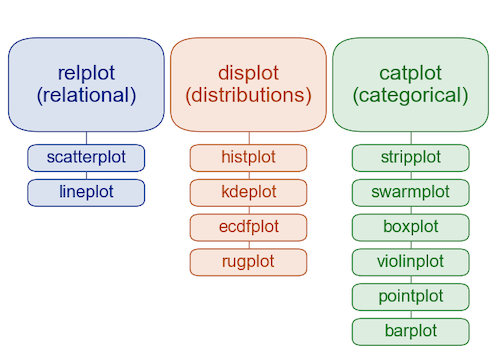
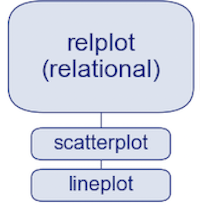
The seaborn hierarchy of plot types#
We’ll learn more about exactly what this hierarchy means today (and in next lecture).
Example dataset#
Today we’ll work with a new dataset, from Gapminder.
Gapminder is an independent Swedish foundation dedicated to publishing and analyzing data to correct misconceptions about the world.
Between 1952-2007, has data about
life_exp,gdp_cap, andpopulation.
df_gapminder = pd.read_csv("data/viz/gapminder_full.csv")
df_gapminder.head(2)
| country | year | population | continent | life_exp | gdp_cap | |
|---|---|---|---|---|---|---|
| 0 | Afghanistan | 1952 | 8425333 | Asia | 28.801 | 779.445314 |
| 1 | Afghanistan | 1957 | 9240934 | Asia | 30.332 | 820.853030 |
df_gapminder.shape
(1704, 6)
Univariate plots#
A univariate plot is a visualization of only a single variable, i.e., a distribution.
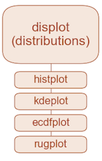
Histograms with sns.histplot#
We’ve produced histograms with
plt.hist.With
seaborn, we can usesns.histplot(...).
Rather than use df['col_name'], we can use the syntax:
sns.histplot(data = df, x = col_name)
This will become even more useful when we start making bivariate plots.
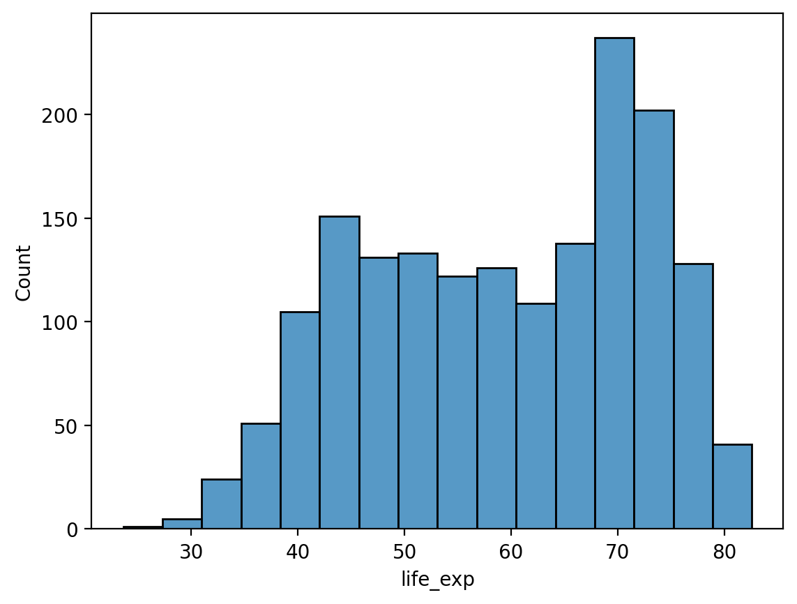
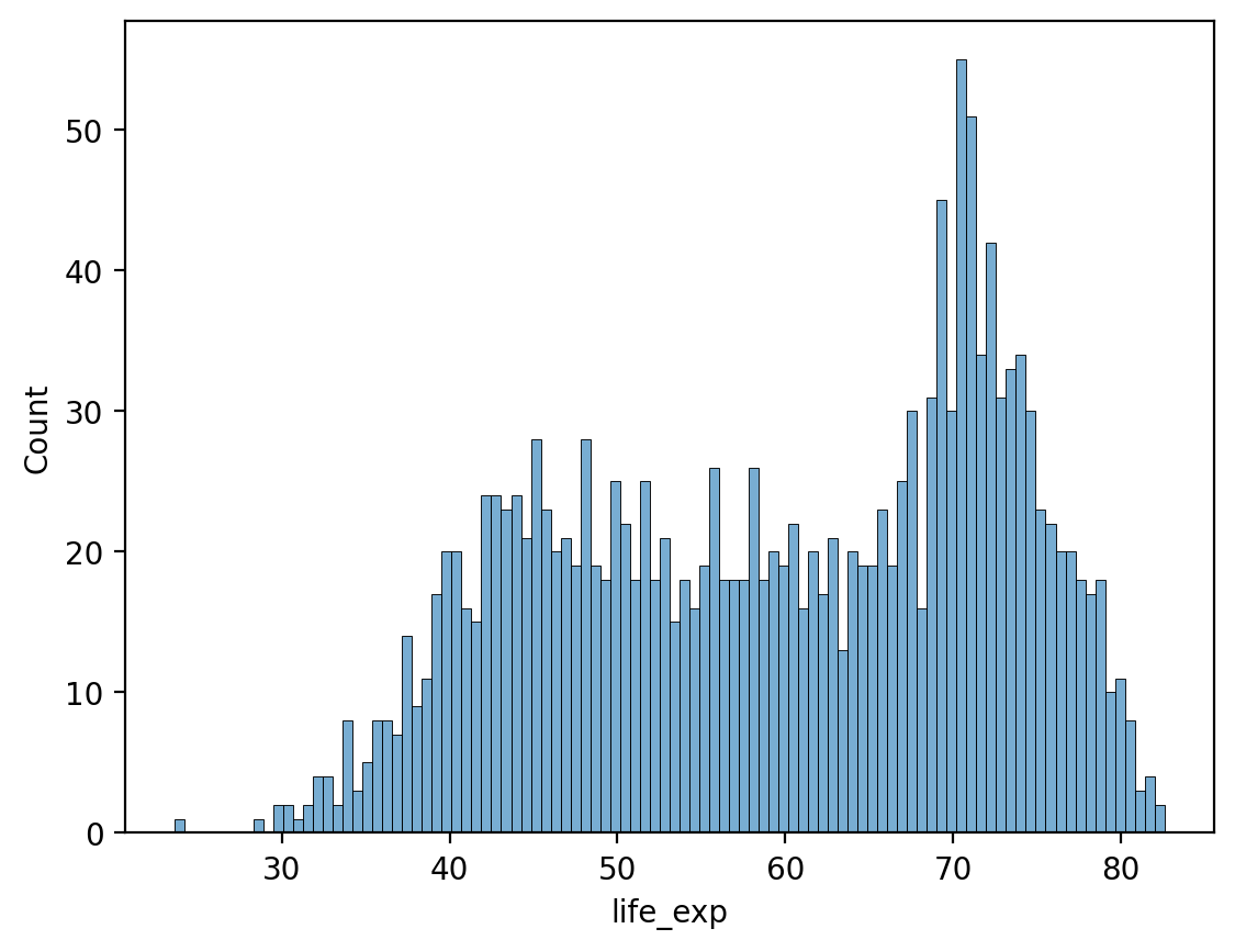
# Histogram of life expectancy
sns.histplot(df_gapminder['life_exp'])
<Axes: xlabel='life_exp', ylabel='Count'>
Modifying the number of bins#
As with plt.hist, we can modify the number of bins.
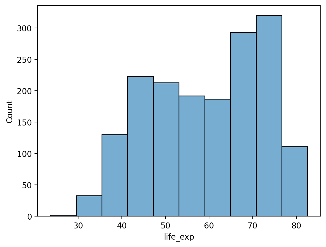
# Fewer bins
sns.histplot(data = df_gapminder, x = 'life_exp', bins = 10, alpha = .6)
<Axes: xlabel='life_exp', ylabel='Count'>
# Many more bins!
sns.histplot(data = df_gapminder, x = 'life_exp', bins = 100, alpha = .6)
<Axes: xlabel='life_exp', ylabel='Count'>
Modifying the y-axis with stat#
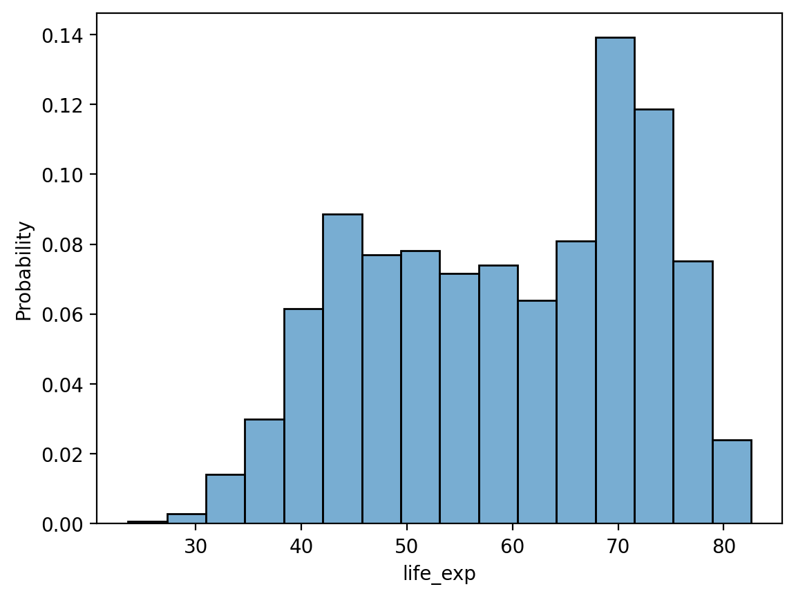
By default, sns.histplot will plot the count in each bin. However, we can change this using the stat parameter:
probability: normalize such that bar heights sum to1.percent: normalize such that bar heights sum to100.density: normalize such that total area sums to1.
# Note the modified y-axis!
sns.histplot(data = df_gapminder, x = 'life_exp', stat = "probability", alpha = .6)
<Axes: xlabel='life_exp', ylabel='Probability'>
Check-in#
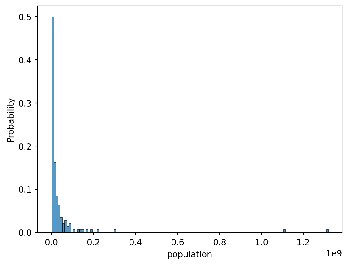
How would you make a histogram showing the distribution of population values in 2007 alone?
Bonus 1: Modify this graph to show
probability, notcount.Bonus 2: What do you notice about this graph, and how might you change it?
### Your code here
Solution (pt. 1)#
### original graph
sns.histplot(data = df_gapminder[df_gapminder['year']==2007], x = 'population', stat = 'probability')
<Axes: xlabel='population', ylabel='Probability'>
Solution (pt. 2)#
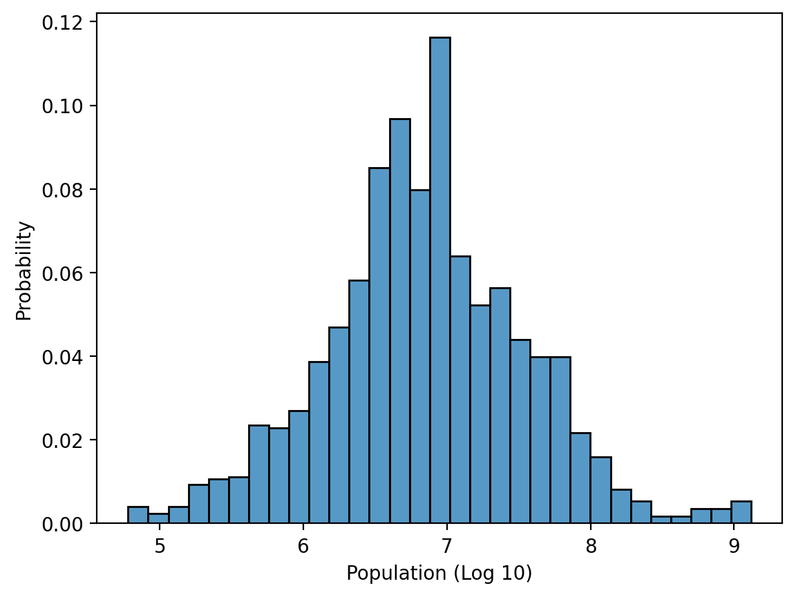
The plot is extremely right-skewed. We could transform it using a log-transform.
df_gapminder['pop_log'] = df_gapminder['population'].apply(lambda x: np.log10(x))
sns.histplot(data = df_gapminder, x = 'pop_log', stat = 'probability')
plt.xlabel("Population (Log 10)")
Text(0.5, 0, 'Population (Log 10)')
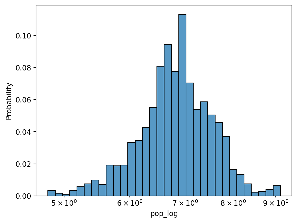
Solution (pt. 3) using log_scale#
Rather than transforming the data directly, we can do this using sns.histplot.
sns.histplot(data = df_gapminder, x = 'pop_log', stat = 'probability', log_scale = True)
<Axes: xlabel='pop_log', ylabel='Probability'>
Bivariate continuous plots#
A bivariate continuous plot visualizes the relationship between two continuous variables.
Scatterplots with sns.scatterplot#
A scatterplot visualizes the relationship between two continuous variables.
Each observation is plotted as a single dot/mark.
The position on the
(x, y)axes reflects the value of those variables.
One way to make a scatterplot in seaborn is using sns.scatterplot.
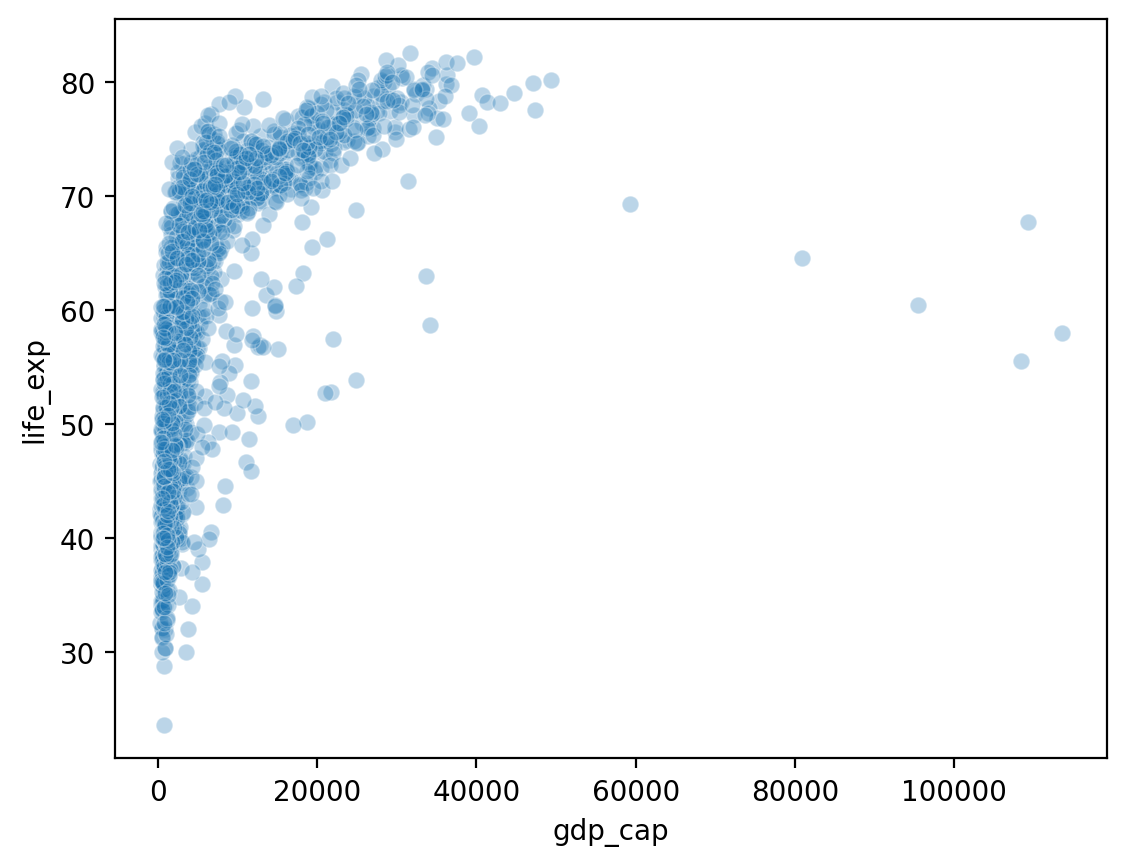
Showing gdp_cap by life_exp#
What do we notice about gdp_cap?
sns.scatterplot(data = df_gapminder, x = 'gdp_cap',
               y = 'life_exp', alpha = .3)
<Axes: xlabel='gdp_cap', ylabel='life_exp'>
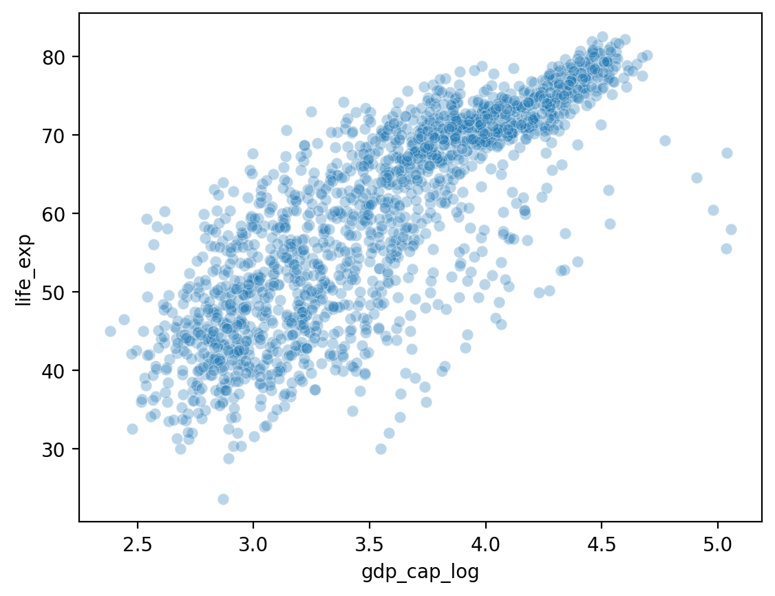
Showing gdp_cap_log by life_exp#
## Log GDP
df_gapminder['gdp_cap_log'] = np.log10(df_gapminder['gdp_cap'])
## Show log GDP by life exp
sns.scatterplot(data = df_gapminder, x = 'gdp_cap_log', y = 'life_exp', alpha = .3)
<Axes: xlabel='gdp_cap_log', ylabel='life_exp'>
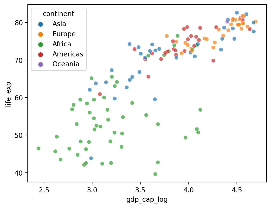
Adding a hue#
What if we want to add a third component that’s categorical, like
continent?seabornallows us to do this withhue.
## Log GDP
df_gapminder['gdp_cap_log'] = np.log10(df_gapminder['gdp_cap'])
## Show log GDP by life exp
sns.scatterplot(data = df_gapminder[df_gapminder['year'] == 2007],
               x = 'gdp_cap_log', y = 'life_exp', hue = "continent", alpha = .7)
<Axes: xlabel='gdp_cap_log', ylabel='life_exp'>
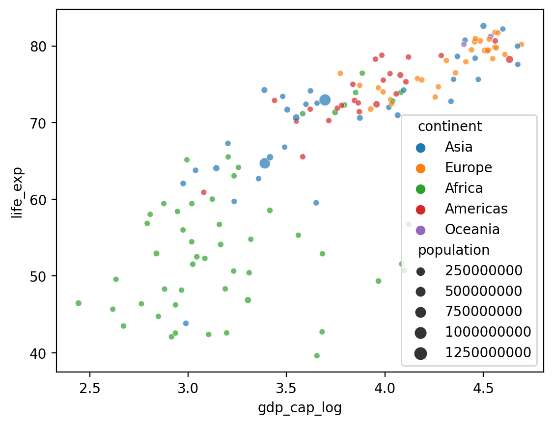
Adding a size#
What if we want to add a fourth component that’s continuous, like
population?seabornallows us to do this withsize.
## Log GDP
df_gapminder['gdp_cap_log'] = np.log10(df_gapminder['gdp_cap'])
## Show log GDP by life exp
sns.scatterplot(data = df_gapminder[df_gapminder['year'] == 2007],
               x = 'gdp_cap_log', y = 'life_exp',
                hue = "continent", size = 'population', alpha = .7)
<Axes: xlabel='gdp_cap_log', ylabel='life_exp'>
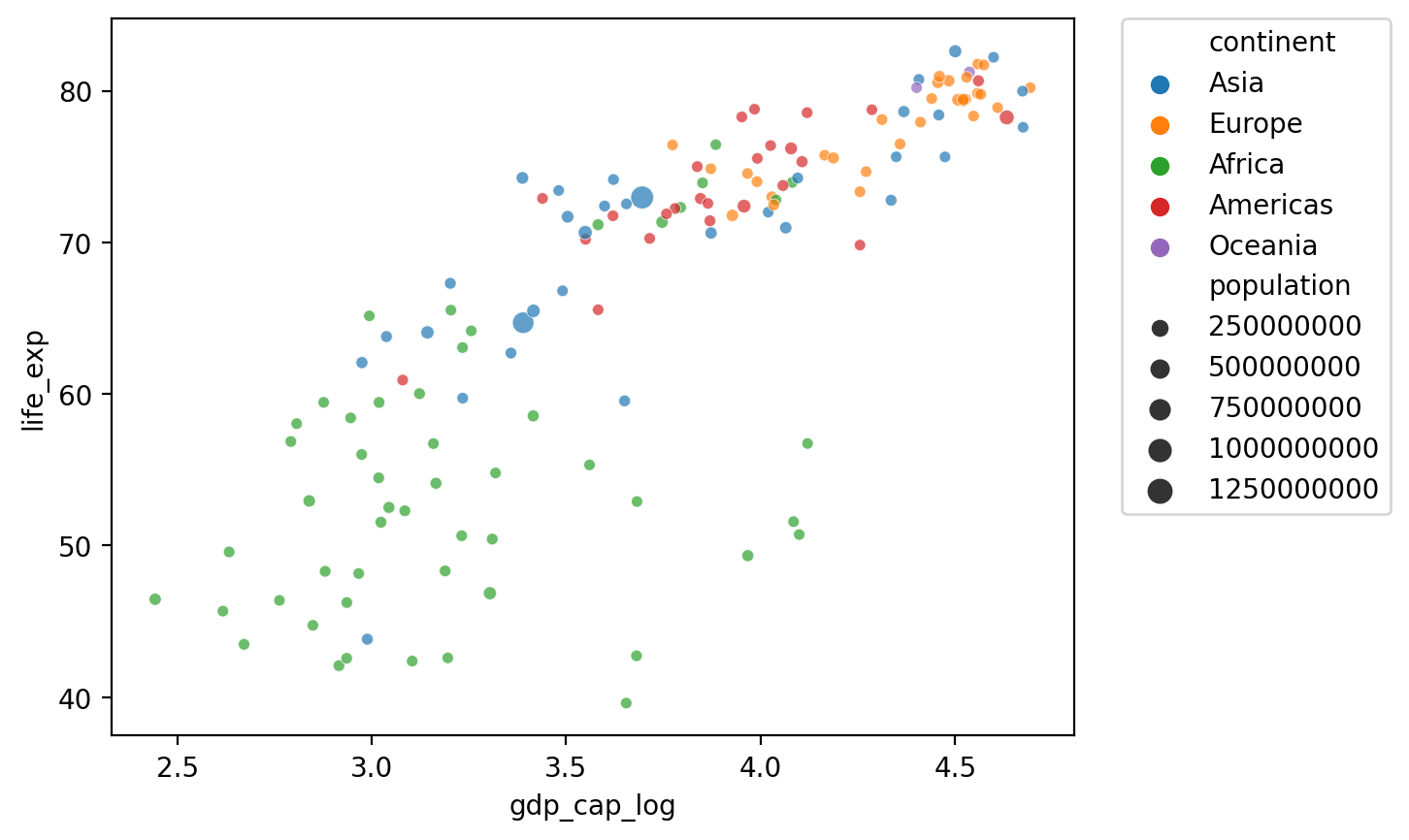
Changing the position of the legend#
## Show log GDP by life exp
sns.scatterplot(data = df_gapminder[df_gapminder['year'] == 2007],
               x = 'gdp_cap_log', y = 'life_exp',
                hue = "continent", size = 'population', alpha = .7)

plt.legend(bbox_to_anchor=(1.05, 1), loc='upper left', borderaxespad=0)
<matplotlib.legend.Legend at 0x168779910>
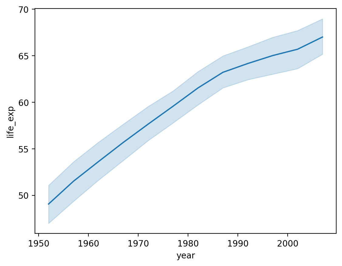
Lineplots with sns.lineplot#
A lineplot also visualizes the relationship between two continuous variables.
Typically, the position of the line on the
yaxis reflects the mean of they-axis variable for that value ofx.Often used for plotting change over time.
One way to make a lineplot in seaborn is using sns.lineplot.
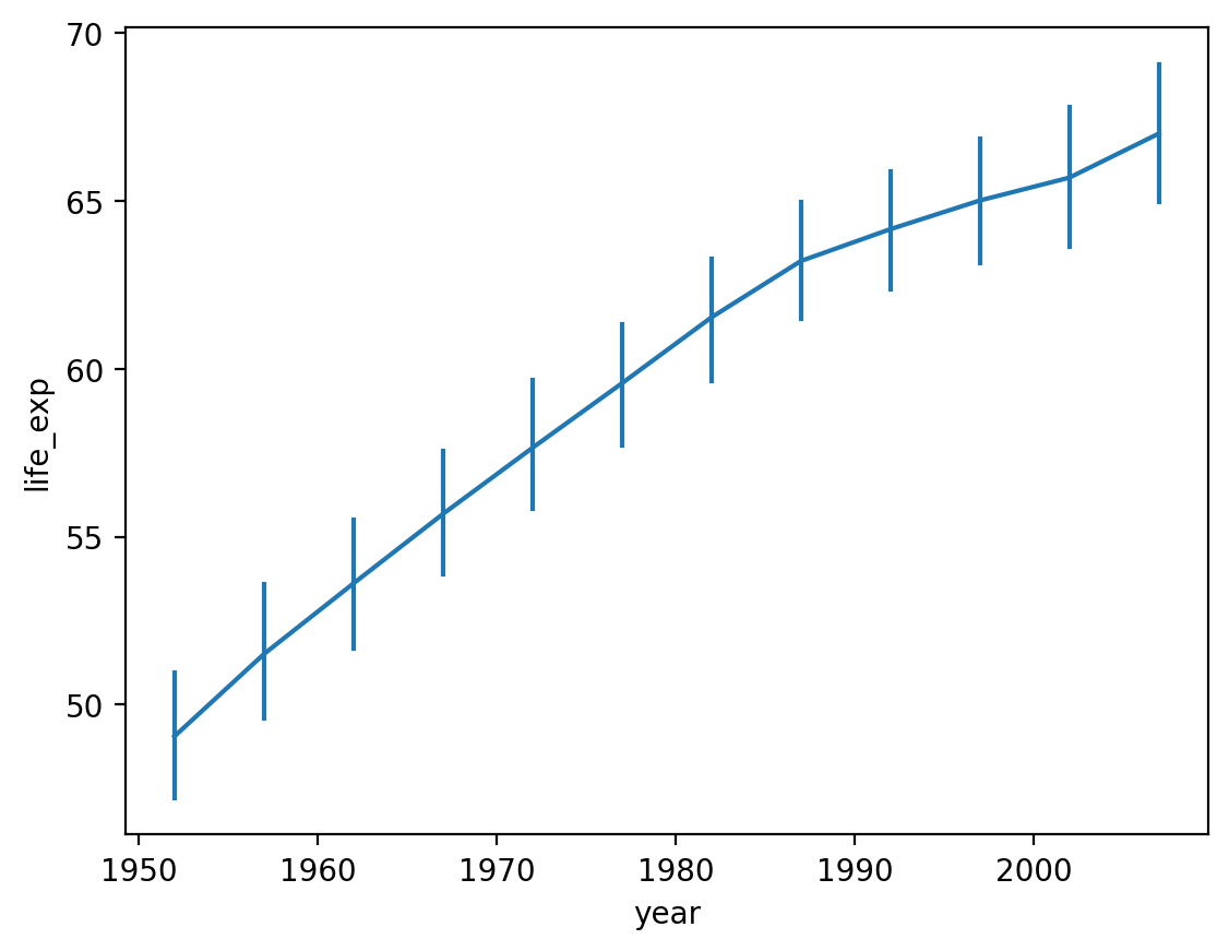
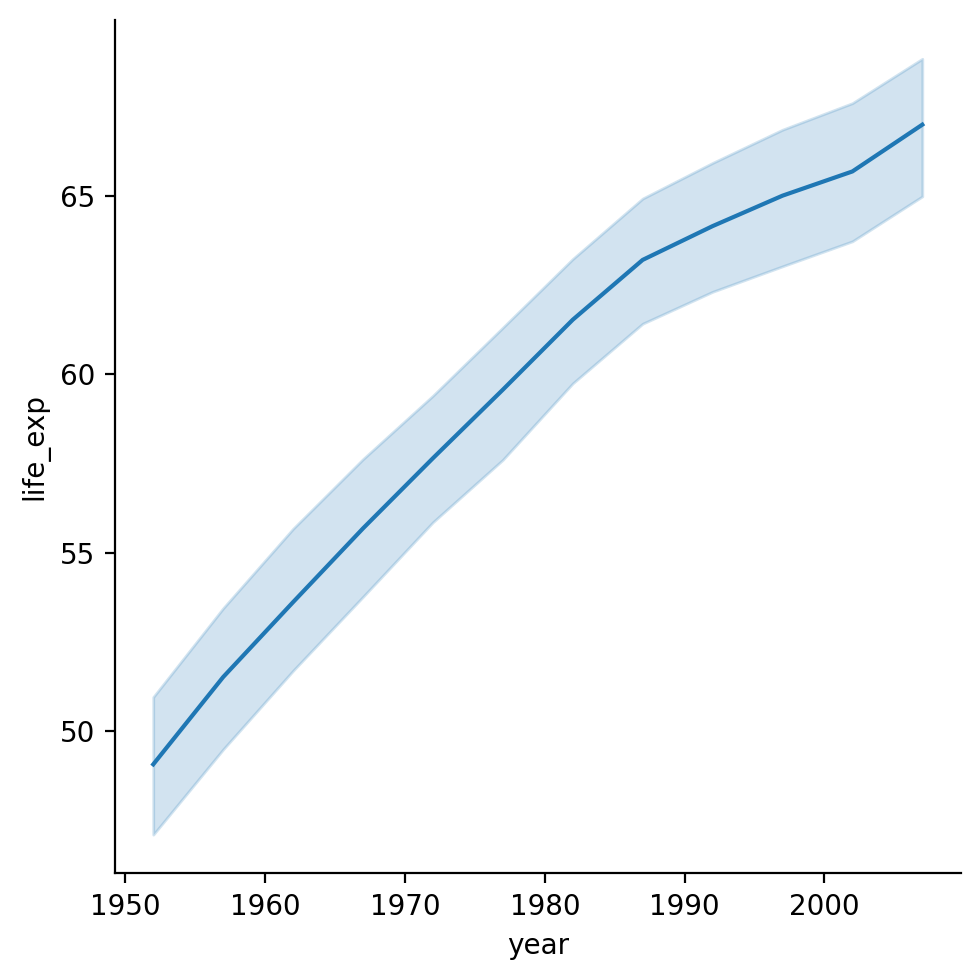
Showing life_exp by year#
What general trend do we notice?
sns.lineplot(data = df_gapminder,
             x = 'year',
             y = 'life_exp')
<Axes: xlabel='year', ylabel='life_exp'>
Modifying how error/uncertainty is displayed#
By default,
seaborn.lineplotwill draw shading around the line representing a confidence interval.We can change this with
errstyle.
sns.lineplot(data = df_gapminder,
             x = 'year',
             y = 'life_exp',
            err_style = "bars")
<Axes: xlabel='year', ylabel='life_exp'>
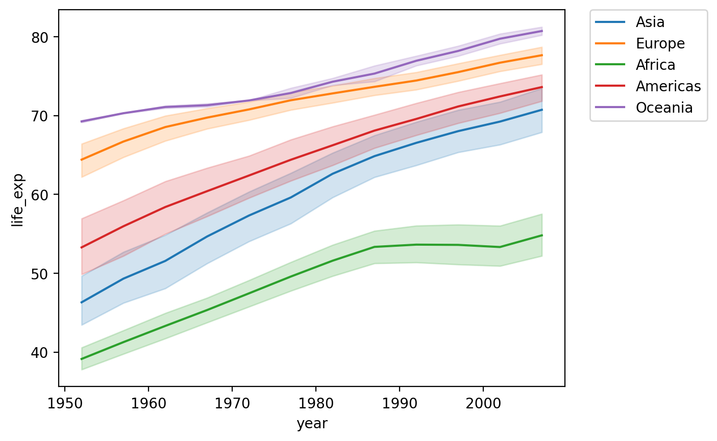
Adding a hue#
We could also show this by
continent.There’s (fortunately) a positive trend line for each
continent.
sns.lineplot(data = df_gapminder,
             x = 'year',
             y = 'life_exp',
            hue = "continent")
plt.legend(bbox_to_anchor=(1.05, 1), loc='upper left', borderaxespad=0)
<matplotlib.legend.Legend at 0x16913d7d0>
Check-in#
How would you plot the relationship between year and gdp_cap for countries in the Americas only?
### Your code here
Solution#
What do we notice about:
The overall trend line?
The error bands as
yearincreases?
sns.lineplot(data = df_gapminder[df_gapminder['continent']=="Americas"],
             x = 'year',
             y = 'gdp_cap')
<Axes: xlabel='year', ylabel='gdp_cap'>
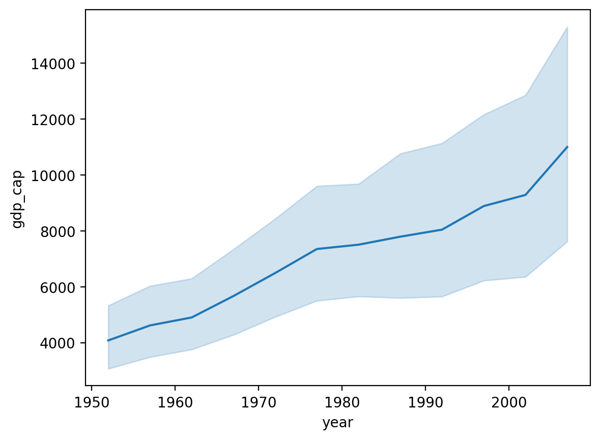
Heteroskedasticity in gdp_cap by year#
Heteroskedasticity is when the variance in one variable (e.g.,
gdp_cap) changes as a function of another variable (e.g.,year).In this case, why do you think that is?
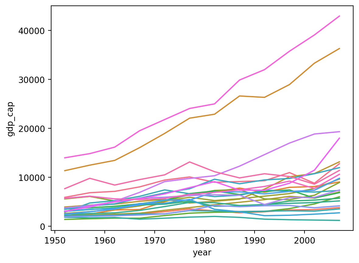
Plotting by country#
There are too many countries to clearly display in the
legend.But the top two lines are the
United StatesandCanada.I.e., two countries have gotten much wealthier per capita, while the others have not seen the same economic growth.
sns.lineplot(data = df_gapminder[df_gapminder['continent']=="Americas"],
             x = 'year', y = 'gdp_cap', hue = "country", legend = None)
<Axes: xlabel='year', ylabel='gdp_cap'>
Using replot#
relplotallows you to plot either line plots or scatter plots usingkind.relplotalso makes it easier tofacet(which we’ll discuss momentarily).
sns.relplot(data = df_gapminder, x = "year", y = "life_exp", kind = "line")
/Users/seantrott/anaconda3/lib/python3.11/site-packages/seaborn/axisgrid.py:118: UserWarning: The figure layout has changed to tight
  self._figure.tight_layout(*args, **kwargs)
<seaborn.axisgrid.FacetGrid at 0x1690401d0>
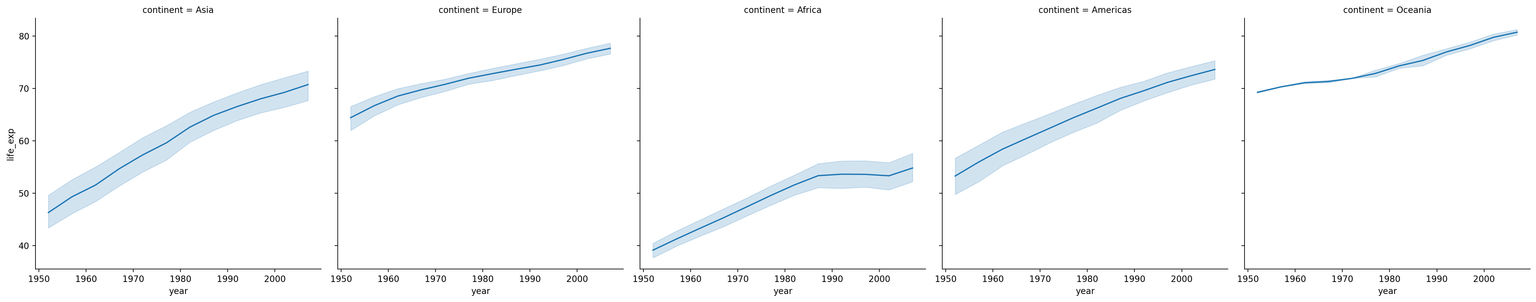
Faceting into rows and cols#
We can also plot the same relationship across multiple “windows” or facets by adding a rows/cols parameter.
sns.relplot(data = df_gapminder, x = "year", y = "life_exp", kind = "line", col = "continent")
/Users/seantrott/anaconda3/lib/python3.11/site-packages/seaborn/axisgrid.py:118: UserWarning: The figure layout has changed to tight
  self._figure.tight_layout(*args, **kwargs)
<seaborn.axisgrid.FacetGrid at 0x1692edb10>
Bivariate categorical plots#
A bivariate categorical plot visualizes the relationship between one categorical variable and one continuous variable.
Example dataset#
Here, we’ll return to our Pokemon dataset, which has more examples of categorical variables.
df_pokemon = pd.read_csv("data/pokemon.csv")
Barplots with sns.barplot#
A barplot visualizes the relationship between one continuous variable and a categorical variable.
The height of each bar generally indicates the mean of the continuous variable.
Each bar represents a different level of the categorical variable.
With seaborn, we can use the function sns.barplot.
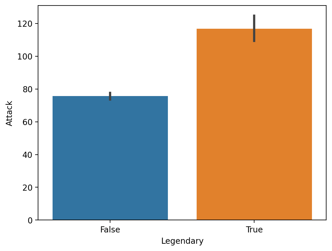
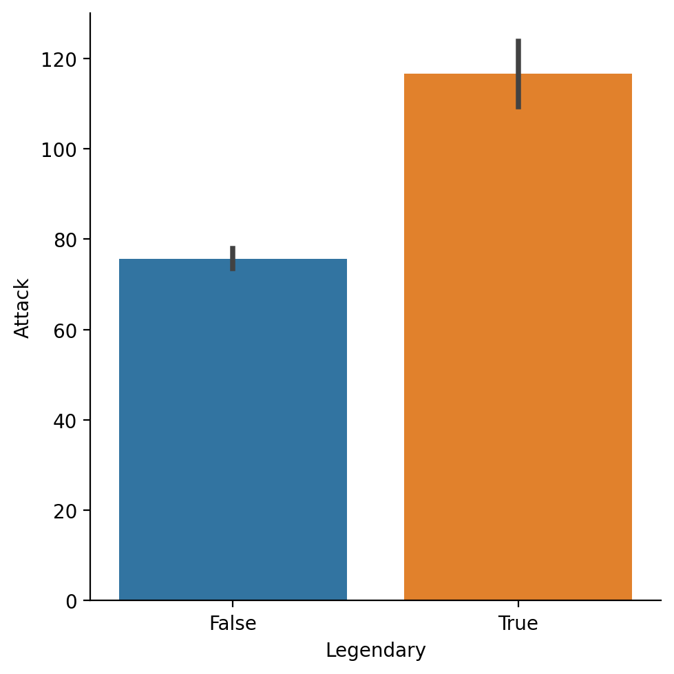
Average Attack by Legendary status#
sns.barplot(data = df_pokemon,
           x = "Legendary", y = "Attack")
<Axes: xlabel='Legendary', ylabel='Attack'>
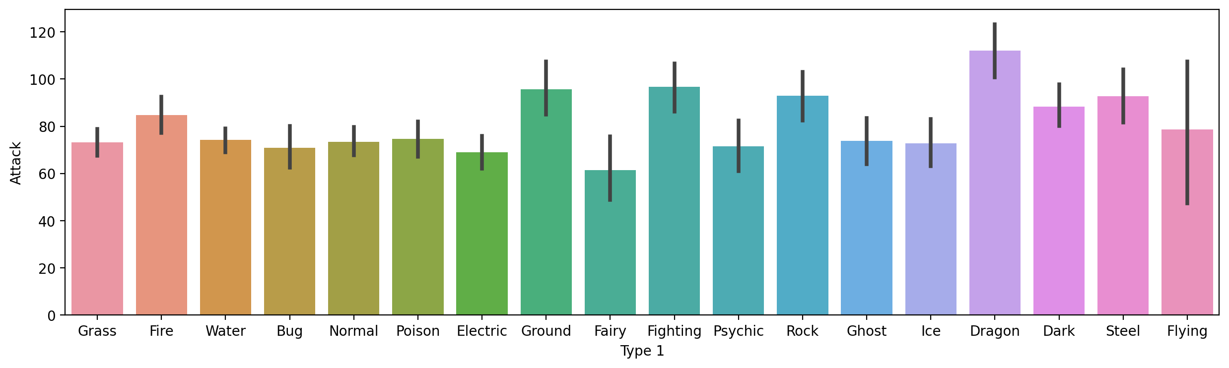
Average Attack by Type 1#
Here, notice that I make the figure bigger, to make sure the labels all fit.
plt.figure(figsize=(15,4))
sns.barplot(data = df_pokemon,
           x = "Type 1", y = "Attack")
<Axes: xlabel='Type 1', ylabel='Attack'>
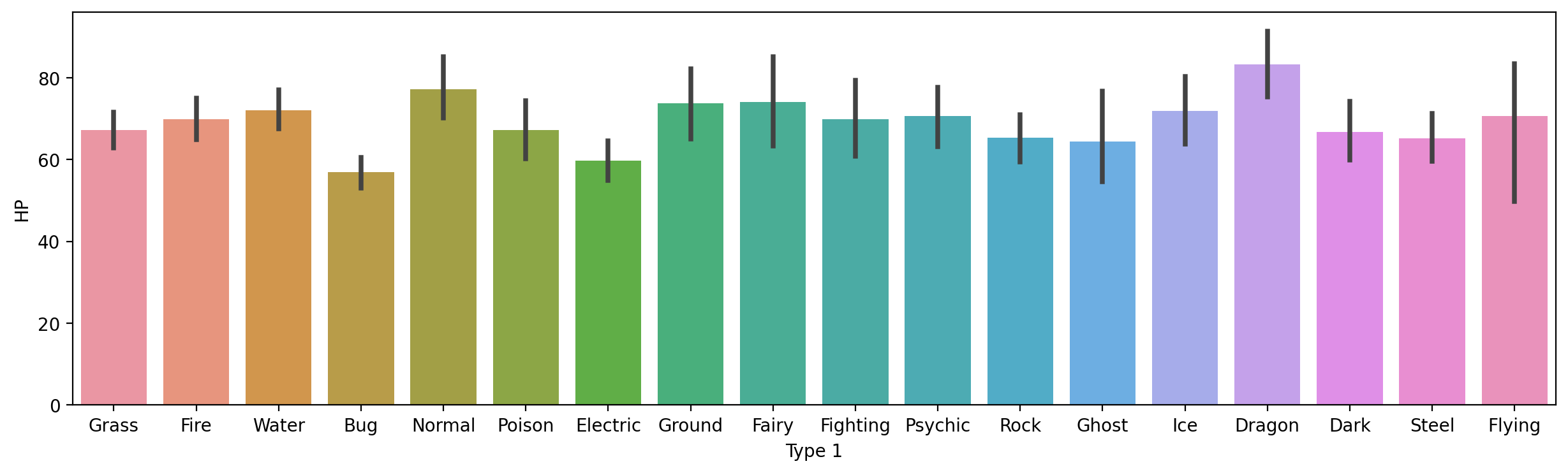
Check-in#
How would you plot HP by Type 1?
### Your code here
Solution#
plt.figure(figsize=(15,4))
sns.barplot(data = df_pokemon,
           x = "Type 1", y = "HP")
<Axes: xlabel='Type 1', ylabel='HP'>
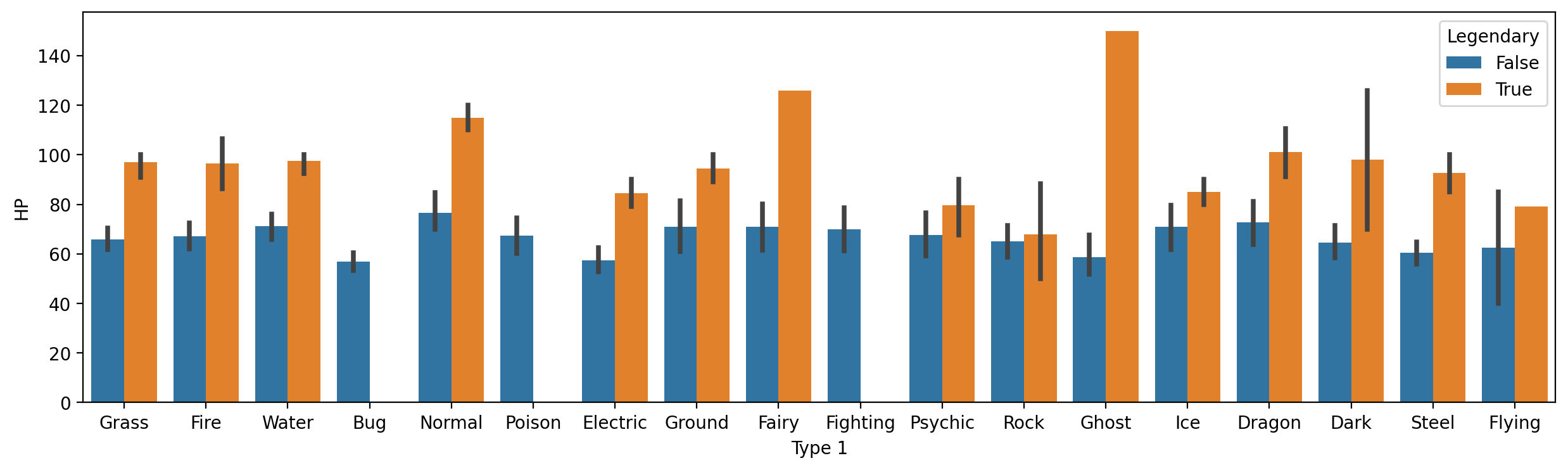
Modifying hue#
As with scatterplot and lineplot, we can change the hue to give further granularity.
E.g.,
HPbyType 1, further divided byLegendarystatus.
plt.figure(figsize=(15,4))
sns.barplot(data = df_pokemon,
           x = "Type 1", y = "HP", hue = "Legendary")
<Axes: xlabel='Type 1', ylabel='HP'>
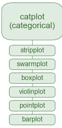
Using catplot#
seaborn.catplotis a convenient function for plotting bivariate categorical data using a range of plot types (bar,box,strip).
sns.catplot(data = df_pokemon, x = "Legendary",
             y = "Attack", kind = "bar")
/Users/seantrott/anaconda3/lib/python3.11/site-packages/seaborn/axisgrid.py:118: UserWarning: The figure layout has changed to tight
  self._figure.tight_layout(*args, **kwargs)
<seaborn.axisgrid.FacetGrid at 0x16878f9d0>
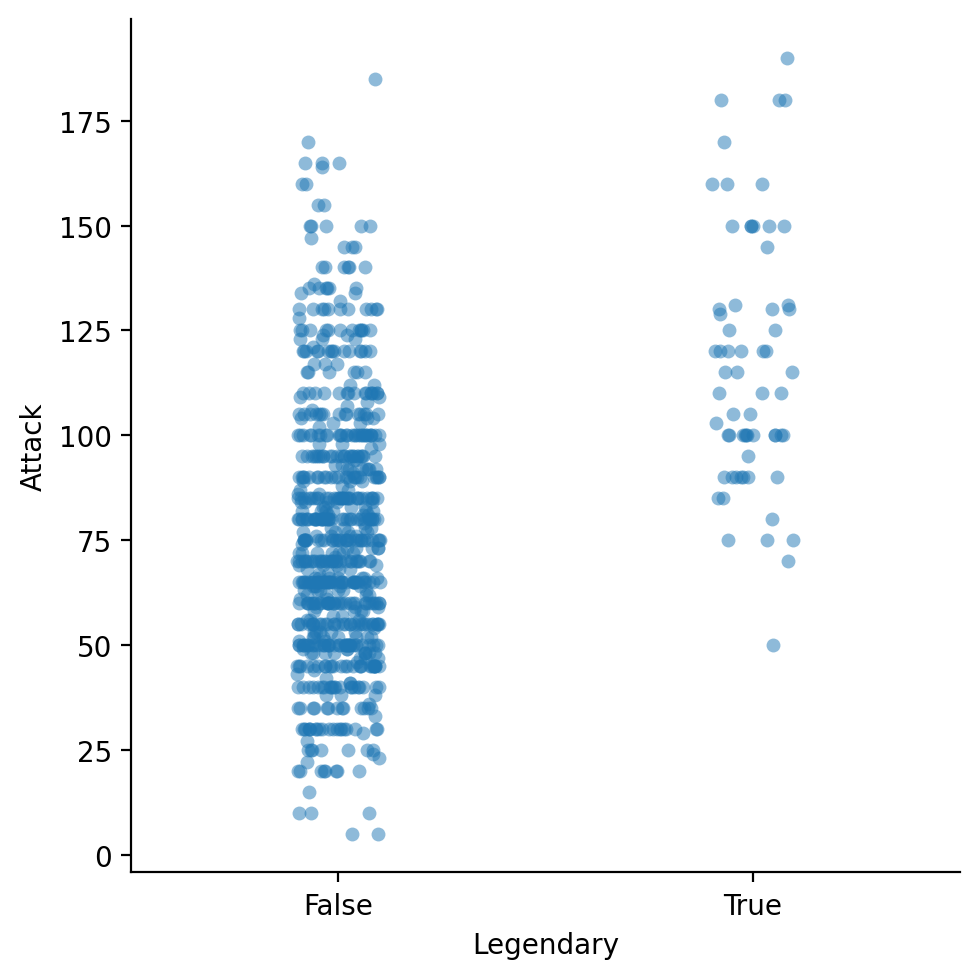
strip plots#
A
stripplot shows each individual point (like a scatterplot), divided by a category label.
sns.catplot(data = df_pokemon, x = "Legendary",
             y = "Attack", kind = "strip", alpha = .5)
/Users/seantrott/anaconda3/lib/python3.11/site-packages/seaborn/axisgrid.py:118: UserWarning: The figure layout has changed to tight
  self._figure.tight_layout(*args, **kwargs)
<seaborn.axisgrid.FacetGrid at 0x16c6f0d50>
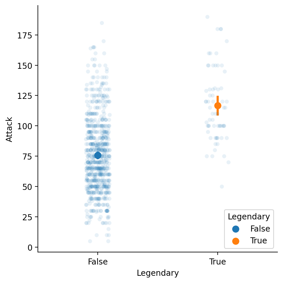
Adding a mean to our strip plot#
We can plot two graphs at the same time, showing both the individual points and the means.
sns.catplot(data = df_pokemon, x = "Legendary",
             y = "Attack", kind = "strip", alpha = .1)
sns.pointplot(data = df_pokemon, x = "Legendary",
             y = "Attack", hue = "Legendary")
/Users/seantrott/anaconda3/lib/python3.11/site-packages/seaborn/axisgrid.py:118: UserWarning: The figure layout has changed to tight
  self._figure.tight_layout(*args, **kwargs)
<Axes: xlabel='Legendary', ylabel='Attack'>
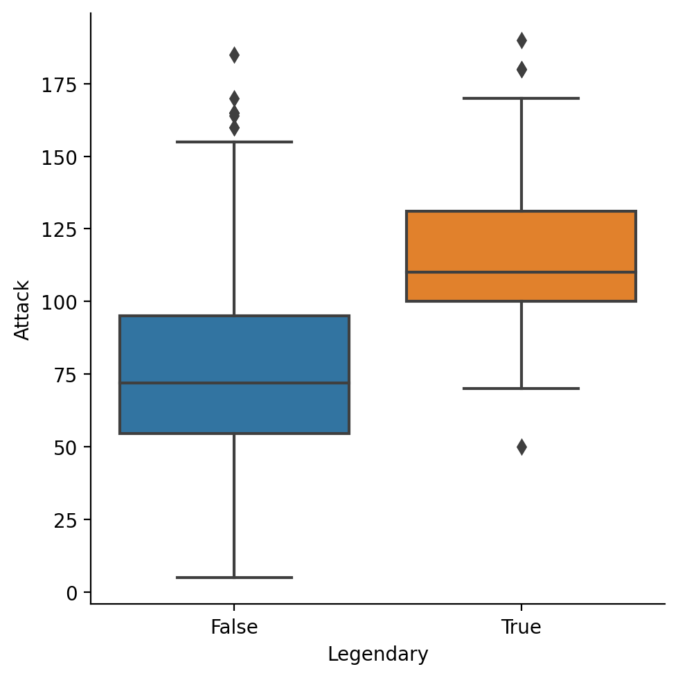
box plots#
A
boxplot shows the interquartile range (the middle 50% of the data), along with the minimum and maximum.
sns.catplot(data = df_pokemon, x = "Legendary",
             y = "Attack", kind = "box")
/Users/seantrott/anaconda3/lib/python3.11/site-packages/seaborn/axisgrid.py:118: UserWarning: The figure layout has changed to tight
  self._figure.tight_layout(*args, **kwargs)
<seaborn.axisgrid.FacetGrid at 0x16c696c90>
Conclusion#
As with our lecture on pyplot, this just scratches the surface.
But now, you’ve had an introduction to:
The
seabornpackage.Plotting both univariate and bivariate data.
Creating plots with multiple layers.