Non-linear regression#
Libraries#
## Imports
import pandas as pd
import numpy as np
import matplotlib.pyplot as plt
import statsmodels.api as sm
import statsmodels.formula.api as smf
import seaborn as sns
import scipy.stats as ss
%matplotlib inline
%config InlineBackend.figure_format = 'retina'  # makes figs nicer!
Goals of this lecture#
Non-linear relationships: why do we care?
Quick “tour” of common non-linear functions.
Accommodating non-linear relationships in the linear regression equation.
Interpreting non-linear models.
Introducing non-linearity#
A non-linear relationship between two variables is one for which the slope of the curve showing the relationship changes as the value of one of the variables changes.
I.e., not just a line!
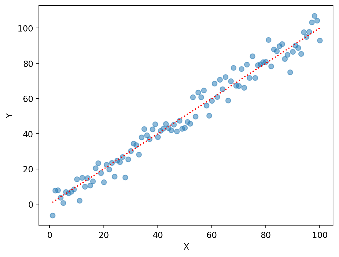
Review: linear regression assumes linearity#
\(Y = \beta_0 + \beta_1X_1 * ... \beta_nX_n + \epsilon\)
X = np.arange(1, 101)
y = X + np.random.normal(scale = 5, size = 100)
plt.scatter(X, y, alpha = .5)
plt.plot(X, X, color = "red", linestyle = "dotted")
plt.xlabel("X")
plt.ylabel("Y")
Text(0, 0.5, 'Y')
Non-linear relationships are common#
Although we often assume linearity, non-linear relationships are common in the real world.
Examples:
Word frequency distribution (power law).
GDP growth (often modeled as exponential).
Some areas of population growth (often modeled as logistic).
Because of this, it’s important to know when the assumption of linearity is not met.
Tour of non-linearity#
Non-linear functions are all non-linear in their own way…
It’s helpful to build visual intuition for what different non-linear functions look like.
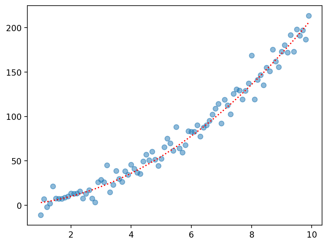
Non-linear function 1: Quadratic#
The quadratic function looks like:
\(f(X) = \beta_2X^2 + \beta_1X^1 + \beta_0\)
Feel free to change the coefficients (or the range of \(X\)) to see the effect on \(Y\).
X = np.arange(1, 10, .1)
b0, b1, b2 = 0, 1, 2
y = b0 + b1 * X + b2 * X ** 2
y_err = np.random.normal(scale = 10, size = len(X))
plt.scatter(X, y + y_err, alpha = .5)
plt.plot(X, y, linestyle = "dotted", color = "red")
[<matplotlib.lines.Line2D at 0x163923c50>]
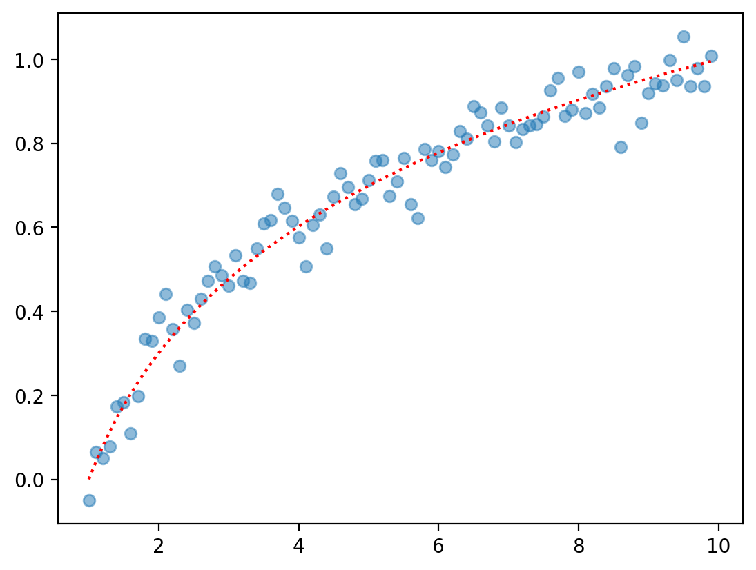
Non-linear function 2: Logarithmic#
A logarithmic function is just the log of \(X\).
\(f(X) = \beta_0 + \beta_1 * \log(X)\)
Feel free to change the coefficients (or the range of \(X\)) to see the effect on \(Y\).
X = np.arange(1, 10, .1)
b0, b1 = 0, 1
y = b0 + b1 * np.log10(X)
y_err = np.random.normal(scale = .05, size = len(X))
plt.scatter(X, y + y_err, alpha = .5)
plt.plot(X, y, linestyle = "dotted", color = "red")
[<matplotlib.lines.Line2D at 0x163b2d010>]
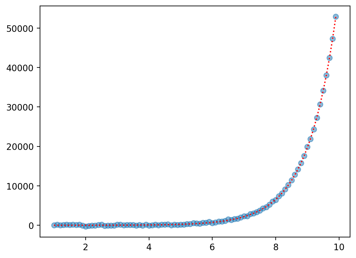
Non-linear function 3: Exponential#
An exponential function raises some base \(n\) to \(X\).
\(f(X) = \beta_0 + \beta_1 ^ X\)
Feel free to change the coefficients (or the range of \(X\)) to see the effect on \(Y\).
X = np.arange(1, 10, .1)
b0, b1 = 0, 3
y = b0 + b1 ** X
y_err = np.random.normal(scale = 100, size = len(X))
plt.scatter(X, y + y_err, alpha = .5)
plt.plot(X, y, linestyle = "dotted", color = "red")
[<matplotlib.lines.Line2D at 0x163906110>]
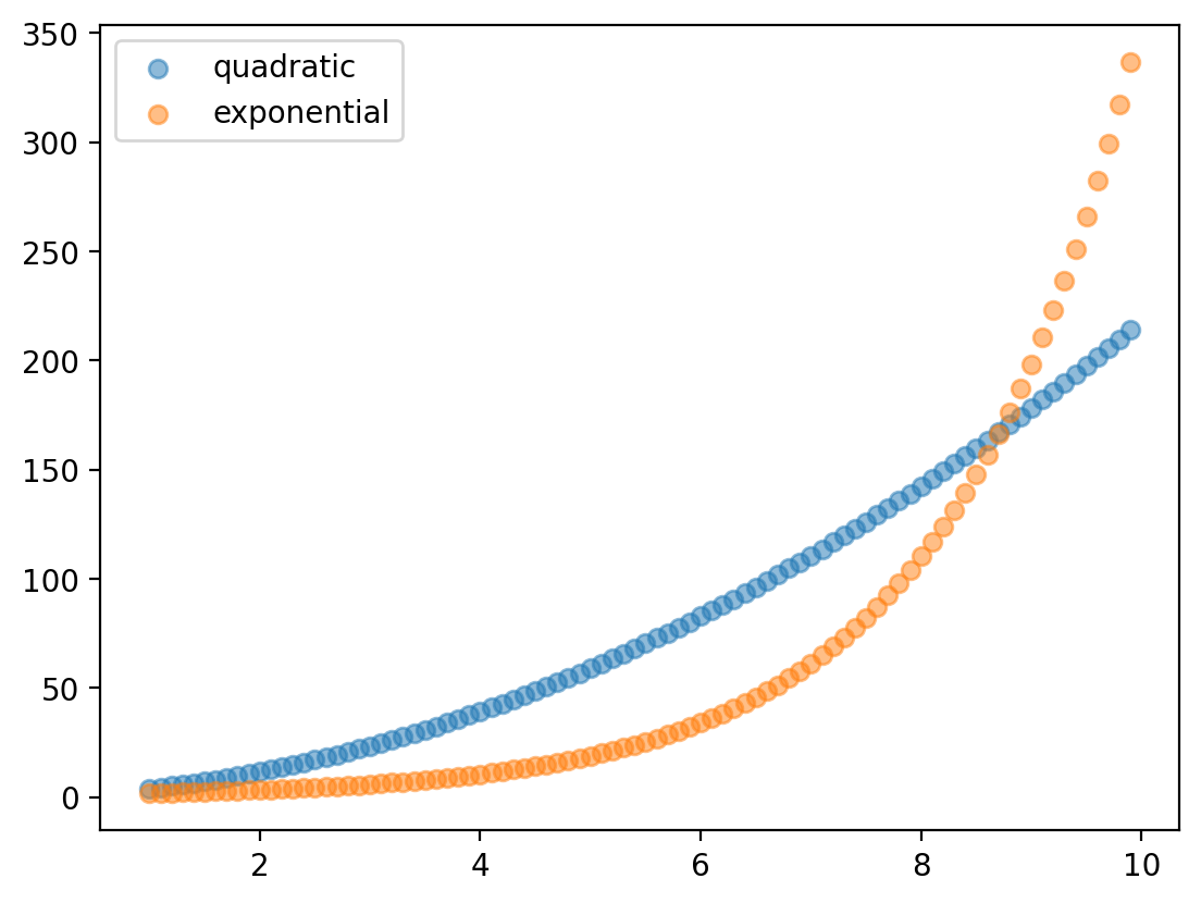
Detour: Exponential vs. quadratic#
Both expontentials and quadratic have an increasing rate of growth.
Exactly how fast depends on \(\beta_1\).
X = np.arange(1, 10, .1)
b0, b1, b2 = 0, 1.8, 2
y_quad = b0 + b1 * X + b2 * X ** 2
y_exp = b0 + b1 ** X
plt.scatter(X, y_quad, alpha = .5, label = "quadratic")
plt.scatter(X, y_exp, alpha = .5, label = "exponential")
plt.legend()
<matplotlib.legend.Legend at 0x163b8d5d0>
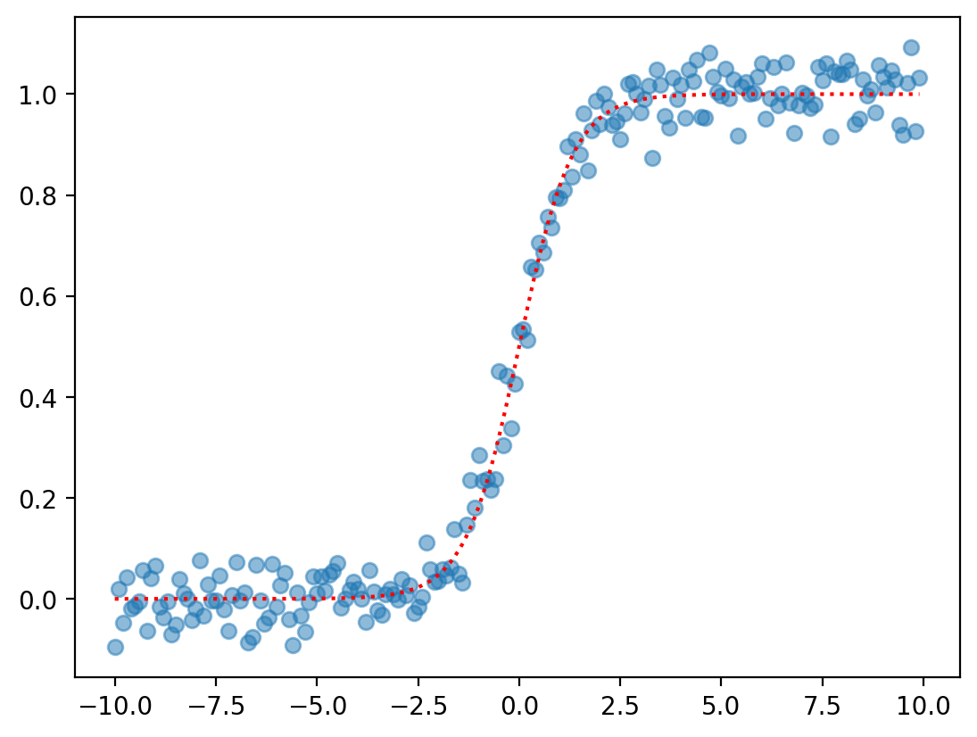
Non-linear function 4: Logistic#
The logistic (or sigmoidal) function produces a classic S-shaped curve.
\(f(x) = \frac{e^{\beta_0 + \beta_1 * X}}{1 + e^{\beta_0 + \beta_1 * X}}\)
X = np.arange(-10, 10, .1)
b0, b1 = 0, 1.5
y = (np.exp(b1 * X + b0))/(1 + np.exp(b1 * X + b0))
y_err = np.random.normal(scale = .05, size = len(X))
plt.scatter(X, y + y_err, alpha = .5)
plt.plot(X, y, linestyle = "dotted", color = "red")
[<matplotlib.lines.Line2D at 0x163c7f710>]
Non-linear functions in…linear regression?#
Rethinking the linear assumption#
The linear assumption is almost always an over-simplification.
Yet the linear equation is an incredibly useful approach to statistical modeling.
Is there a way to preserve the benefits of linear modeling while accommodating non-linear relationships?
One solution is polynomial regression.
Introducing polynomial regression#
Polynomial regression refers to replacing the standard linear model with a polynomial function, whose coefficients can still be estimated using least squares.
The standard linear model looks like:
\(Y = \beta_0 + \beta_1X + \epsilon\)
A polynomial equation might look like:
\(Y = \beta_0 + \beta_1X + \beta_2X^2 + ... + \beta_pX^p + \epsilon\)
Where \(d\) is the order of the polynomial.
Same feature, different transformations#
In polynomial regression, we enter the same predictor (\(X\)) multiple times in the same model.
However, we transform that predictor according to the order (\(p\)) of our polynomial.
Typically, we limit \(p ≤ 4\) to prevent overfitting.
Polynomial regression in action#
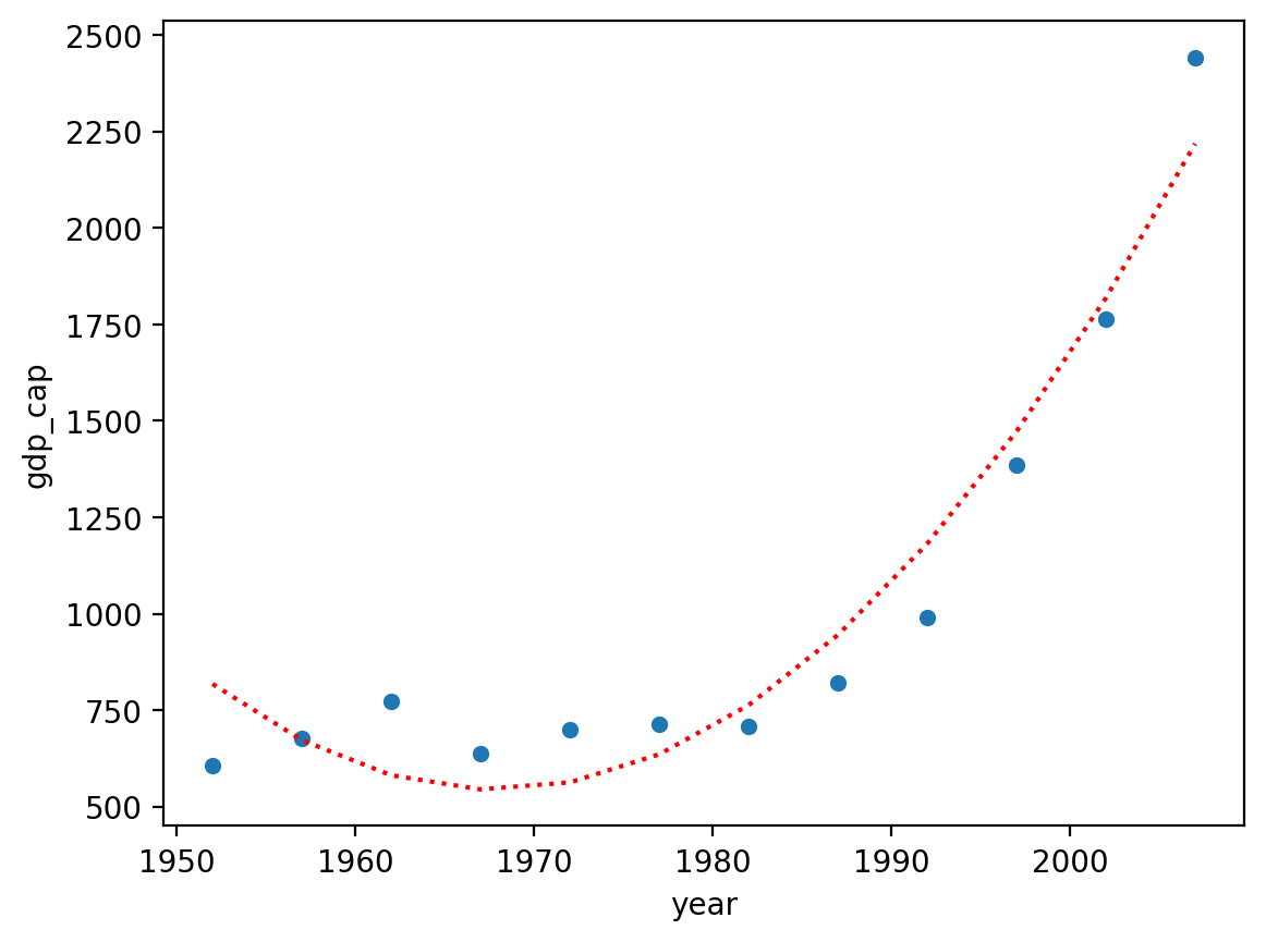
To start, let’s consider a dataset with a clearly non-linear relationship: gdp_cap ~ year in Vietnam.
df_gapminder = pd.read_csv("data/viz/gapminder_full.csv")
df_vietnam = df_gapminder[df_gapminder['country'] == "Vietnam"]
sns.scatterplot(data = df_vietnam, x = "year", y = "gdp_cap")
<Axes: xlabel='year', ylabel='gdp_cap'>
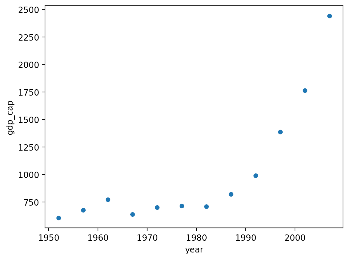
Linear regression is unsuitable#
First, let’s build a linear model and see how it does.
mod_linear = smf.ols(data = df_vietnam, formula = "gdp_cap ~ year").fit()
sns.scatterplot(data = df_vietnam, x = "year", y = "gdp_cap")
plt.plot(df_vietnam['year'], mod_linear.predict(), linestyle = "dotted", color = "red")
[<matplotlib.lines.Line2D at 0x163d37710>]
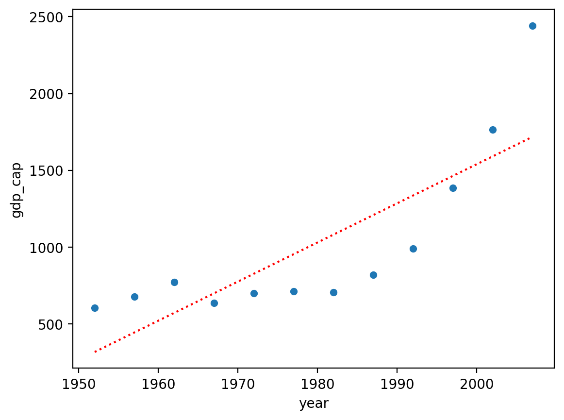
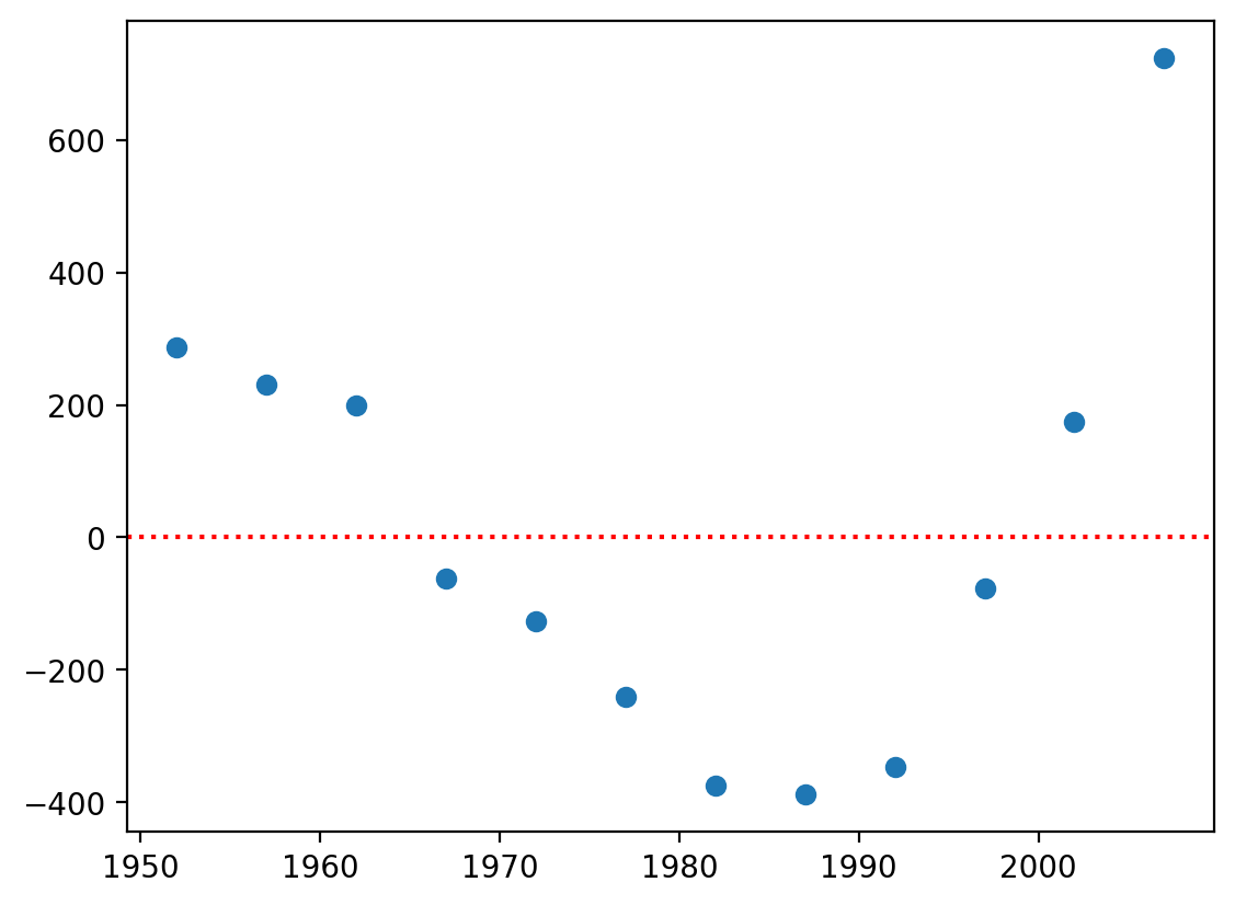
Inspecting our residuals#
One way to identify non-linearity is to inspect your residuals.
Here, it’s clear that our residuals are not normally distributed around values of \(X\).
plt.scatter(df_vietnam['year'], mod_linear.resid)
plt.axhline(y = 0, linestyle = "dotted", color = "red")
<matplotlib.lines.Line2D at 0x163de77d0>
Check-in#
What does the current linear equation look like? How could we transform it to a polynomial function?
### Your code here
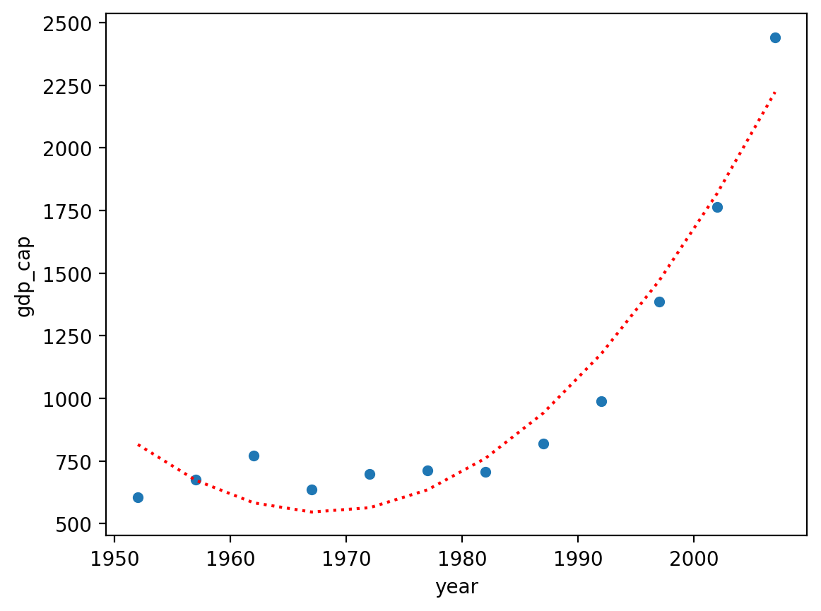
“Upgrading” our model#
Our ordinary regression model looks like:
\(GDP = \beta_0 + \beta_{1}*Year + \epsilon\)
We can upgrade it to a \(2\)-degree polynomial like so:
\(GDP = \beta_0 + \beta_{1}*Year + \beta_{2}*Year^2 + \epsilon\)
Polynomial functions in statsmodels: approach 1#
As a first step, we can simply create a new variable, which is \(Year^2\), and insert it into the regression equation.
df_vietnam['year_sq'] = df_vietnam['year'].values ** 2
mod_poly = smf.ols(data = df_vietnam, formula = "gdp_cap ~ year + year_sq").fit()
/var/folders/pn/5zbmv0cj31v6hmyh53njhmdw0000gn/T/ipykernel_1744/2027117275.py:1: SettingWithCopyWarning:
A value is trying to be set on a copy of a slice from a DataFrame.
Try using .loc[row_indexer,col_indexer] = value instead

See the caveats in the documentation: https://pandas.pydata.org/pandas-docs/stable/user_guide/indexing.html#returning-a-view-versus-a-copy
  df_vietnam['year_sq'] = df_vietnam['year'].values ** 2
Inspecting predictions#
Much better!
sns.scatterplot(data = df_vietnam, x = "year", y = "gdp_cap")
plt.plot(df_vietnam['year'], mod_poly.predict(), linestyle = "dotted", color = "red")
[<matplotlib.lines.Line2D at 0x163eccf50>]
Inspecting coefficients#
On the other hand, our coefficients are much harder to interpret…no longer obeys the simple interpretation of linera regression.
mod_poly.params
Intercept    4.228126e+06
year        -4.296675e+03
year_sq      1.091724e+00
dtype: float64
Polynomial functions in statsmodels: approach 2#
Rather than having to a create new variable for each \(p\)-degree, we can do this directly in statsmodels using a syntactic approach called patsy:
formula = "y ~ x + I(x**2)"...
mod_poly = smf.ols(data = df_vietnam, formula = "gdp_cap ~ year + I(year ** 2)").fit()
mod_poly.params ## Exactly the same as before
Intercept       4.228126e+06
year           -4.296675e+03
I(year ** 2)    1.091724e+00
dtype: float64
Inspecting predictions#
sns.scatterplot(data = df_vietnam, x = "year", y = "gdp_cap")
plt.plot(df_vietnam['year'], mod_poly.predict(), linestyle = "dotted", color = "red")
[<matplotlib.lines.Line2D at 0x164006310>]
Why I(x ** n) is easier#
If we want to create a higher-order polynomial, it’s much easier to just add more terms using I(x ** n).
mod_p3 = smf.ols(data = df_vietnam, formula = "gdp_cap ~ year + I(year ** 2) + I(year ** 3)").fit()
sns.scatterplot(data = df_vietnam, x = "year", y = "gdp_cap")
plt.plot(df_vietnam['year'], mod_p3.predict(), linestyle = "dotted", color = "red")
[<matplotlib.lines.Line2D at 0x16401a450>]
Can \(p\) be too big?#
A higher-order polynomial will always produce a slightly better fit, because it has more degrees of freedom.
However, this flexibility comes with a trade-off:
Higher-order polynomials are harder to interpret.
Higher-order polynomials are more likely to overfit to “noise” in our data.
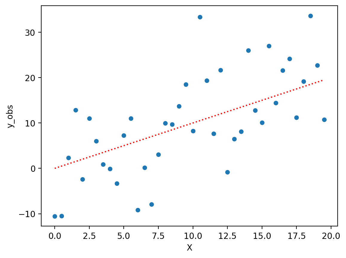
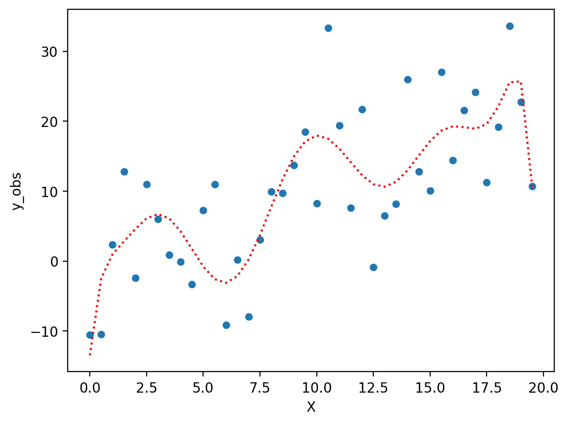
Overfitting in action#
To demonstrate overfitting, we can first produce a simple but noisy linear relationship.
X = np.arange(0, 20, .5)
y = X
err = np.random.normal(scale = 8, size = len(X))
df = pd.DataFrame({'X': X, 'y_true': y, 'y_obs': y + err})
sns.scatterplot(data = df, x = "X", y = "y_obs")
plt.plot(X, y, linestyle = "dotted", color = "red")
[<matplotlib.lines.Line2D at 0x1640c5110>]
Fitting a complex polynomial#
Now, let’s fit a very complex polynomial to these data––even though we know the “true” relationship is linear (albeit noisy).
### Very complex polynomial
mod_p10 = smf.ols(data = df, formula = "y_obs ~ X + I(X**2) + I(X**3) + I(X**4) + I(X**5) + I(X**6)  + I(X**7)  + I(X**8)  + I(X**9)  + I(X**10)").fit()
### Now we have a "better" fit––but it doesn't really reflect the true relationship.
sns.scatterplot(data = df, x = "X", y = "y_obs")
plt.plot(X, mod_p10.predict(), linestyle = "dotted", color = "red")
[<matplotlib.lines.Line2D at 0x16417a5d0>]
Coming up: the bias-variance trade-off#
In general, statistical models display a trade-off between their:
Bias: high “bias” means a model is not very flexible.
E.g., linear regression is a very biased model, so it cannot fit non-linear relationships.
Variance: high “variance” means a model is more likely to overfit.
E.g., polynomial regression is very flexible, but it’s more likely to fit to noise––exhibiting poor generalization across samples.
We’ll explore these concepts much more soon!
Conclusion#
Many relationships are non-linear.
We can extend linear regression to these non-linear relationships using polynomial functions.
A higher-order polynomial is more flexible and can accommodate more relationships.
However, too much flexibility can lead to overfitting.