Introduction to statistical models#
## Imports
import pandas as pd
import numpy as np
import matplotlib.pyplot as plt
import statsmodels.api as sm
import statsmodels.formula.api as smf
import seaborn as sns
import scipy.stats as ss
%matplotlib inline
%config InlineBackend.figure_format = 'retina'  # makes figs nicer!
Goals of this lecture#
From descriptive statistics to statistical models.
Introducing the linear model.
Key assumptions of linear regression.
From descriptions to statistical models#
Describing our data#
So far, we’ve discussed approaches to describing features of our data:
Central tendency (univariate):
mean,median,mode.Variability (univariate):
std,range.Correlation (bivariate):
corr.
But often, we want to do more than simply describe data––we want to model it.
Modeling our data#
A statistical model is a mathematical model representing a “data-generating process”.
Data-generating process = how did our data come to be?
We can’t observe this directly, but we can estimate it.
Usually involves learning a relationship (or function) between different variables (e.g., \(X\) and \(Y\)).
Why models?#
Statistical models help us understand our data, and also predict new data.
Broadly, two “paradigms” of using statistical models:
Prediction: try to predict unseen values of \(Y\), given \(X\).
Inference: try to understand how \(X\) relates to \(Y\), test hypotheses, etc.
Both are very useful, and also compatible.
Prediction vs. inference#
“It’s tough to make predictions, especially about the future” - Yogi Berra
Prediction and inference can be done on the same dataset––it’s mostly about your goals.
Topic |
Prediction |
Inference |
|---|---|---|
Loan repayment |
Will this person repay a loan? |
How does education quality affect loan repayment? |
Road behavior |
Will this vehicle suddenly merge left? |
Which features of a driver correlate with sudden, erratic movements? |
Advertising |
How much can we expect to earn this quarter? |
Which kinds of ads are most successful? |
Models encode functions#
A statistical model often represents a function mapping from \(X\) (inputs) to \(Y\) (outputs).
\(\Large Y = f(X, \beta) + \epsilon\)
\(Y\): what we want to predict (outputs).
\(X\): the features we will use to predict \(Y\) (inputs).
\(\beta\): the weights (or “coefficients”) mapping \(X\) to \(Y\).
\(\epsilon\): residual error from the model
Models aren’t perfect#
No model is perfect; all models have some amount of prediction error, sometimes called residuals (or \(\epsilon\)).
Models have trade-offs#
In general, there is often a trade-off between the flexibility of a model and the interpretability of that model.
More flexible models (e.g., neural networks) can learn more complex functions/relationships, but they are often harder to interpret.
Less flexible models (e.g., linear regression) have higher “bias”, but are often easier to interpret.
The suitability of each model depends on your goals.
Above all, models are tools#
A model is a map of the data––not the data itself.
Richard McElreath compares models to golems.
Powerful machines that follow their instructions to the letter, for better or for worse.
They’re a powerful part of our toolkit, but the final responsibility always rests with the scientist.
Introducing the linear model#
Linear regression: basics#
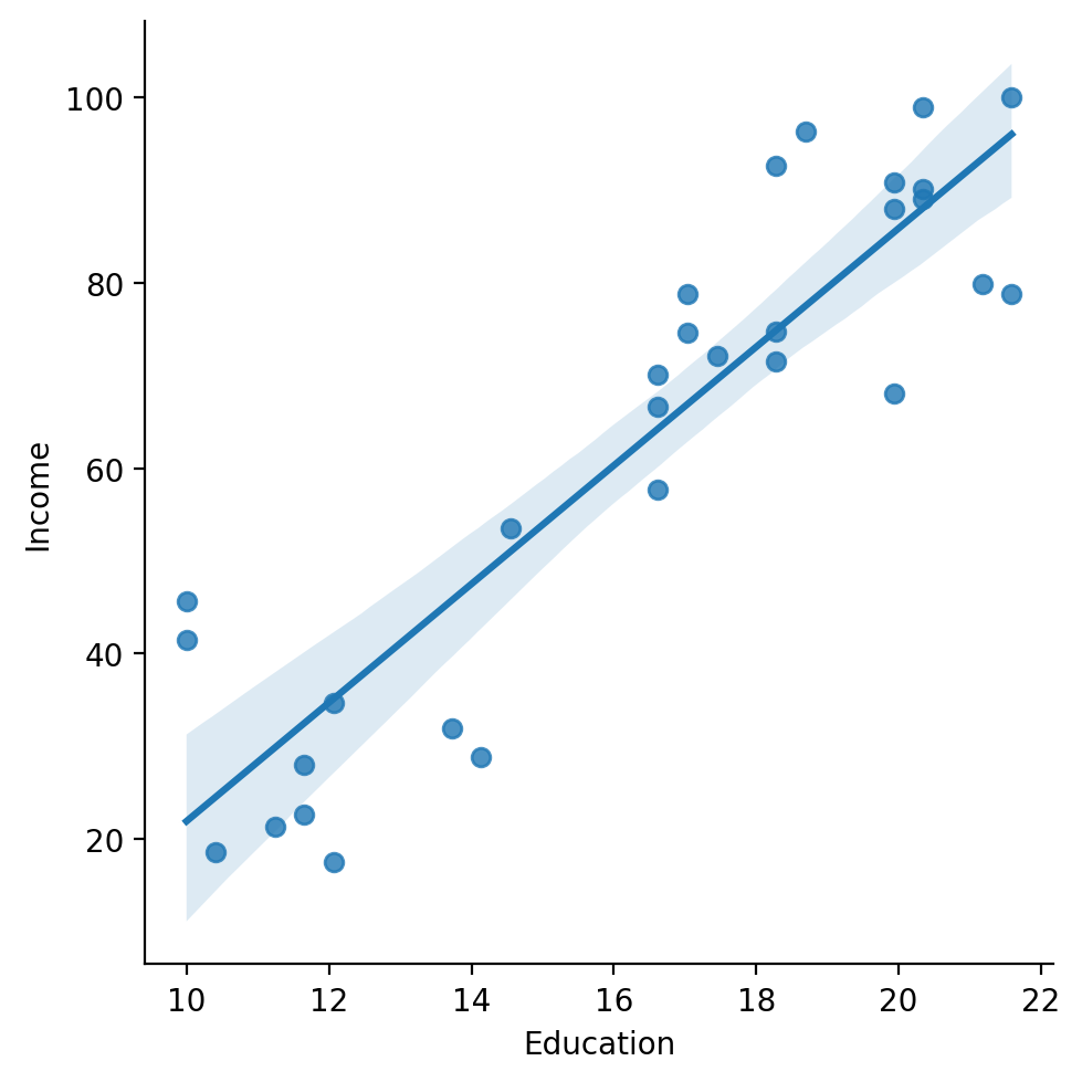
The goal of linear regression is to find the line of best fit between some variable(s) \(X\) and the continuous dependent variable \(Y\).
Assuming a linear relationship between inputs \(X\) and response \(Y\)…
…find parameters \(\beta\) that minimize prediction error.
Allows for many predictors, but we’ll start with univariate regression.
The line of “best fit”#
The goal of linear regression is to find the line of best fit between some variable(s) \(X\) and the dependent variable \(Y\).
df_income = pd.read_csv("data/models/income.csv")
sns.lmplot(data = df_income, x = "Education", y = "Income")
/Users/seantrott/anaconda3/lib/python3.11/site-packages/seaborn/axisgrid.py:118: UserWarning: The figure layout has changed to tight
  self._figure.tight_layout(*args, **kwargs)
<seaborn.axisgrid.FacetGrid at 0x137ca4b50>
The linear equation#
\(\Large Y = \beta_0 + \beta_1X_1 + \epsilon\)
\(\beta_0\), or intercept: predicted \(\hat{Y}\) when \(X_1 = 0\).
\(\beta_1\), or slope: predicted increase in \(\hat{Y}\) for each 1-unit increase in \(X_1\).
When \(X_1\) is categorical, slope (typically) reflects the difference in means between categories.
\(\epsilon\), or error: assumes normally-distributed “leftover variance”.
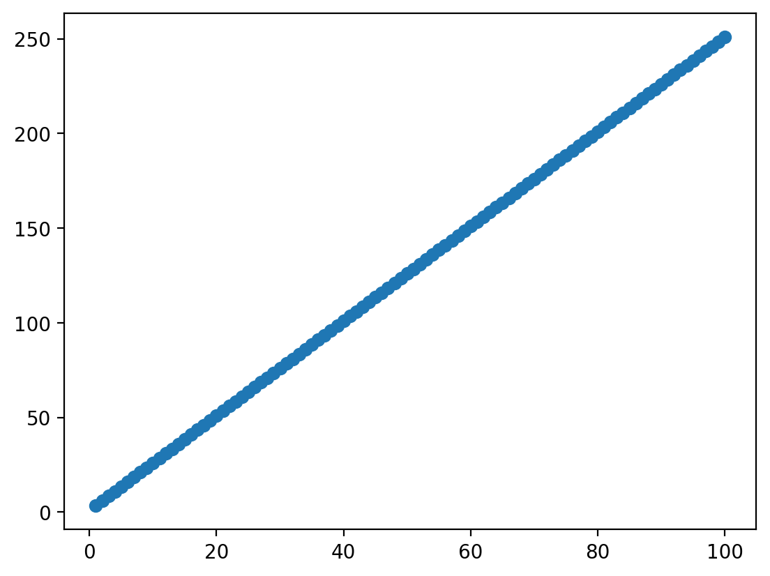
Linear equation in action (no error)#
X = np.arange(1, 101) ### Given some inputs X...
beta = 2.5 ### some coefficient relating X to Y
intercept = 1 ### and some intercept
Y = X*beta + intercept ### we can generate data
plot = plt.scatter(X, Y)
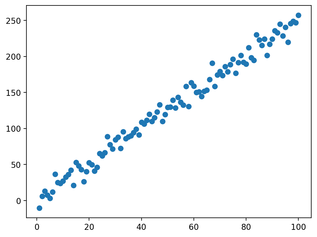
Linear equation in action (with error)#
ERROR = np.random.normal(loc = 0, scale = 10, size = 100)
Y = X*beta + intercept + ERROR ### add error now
plot = plt.scatter(X, Y)
Check-in: the effect of error#
How does changing the scale parameter in np.random.normal change the amount of error? Why is this?
### Your code here
Many possible lines between \(X\) and \(Y\)#
With linear regression, our goal is to learn the coefficients mapping \(X\) to \(Y\):
\(\beta_0\): Intercept.
\(\beta_1\): Slope.
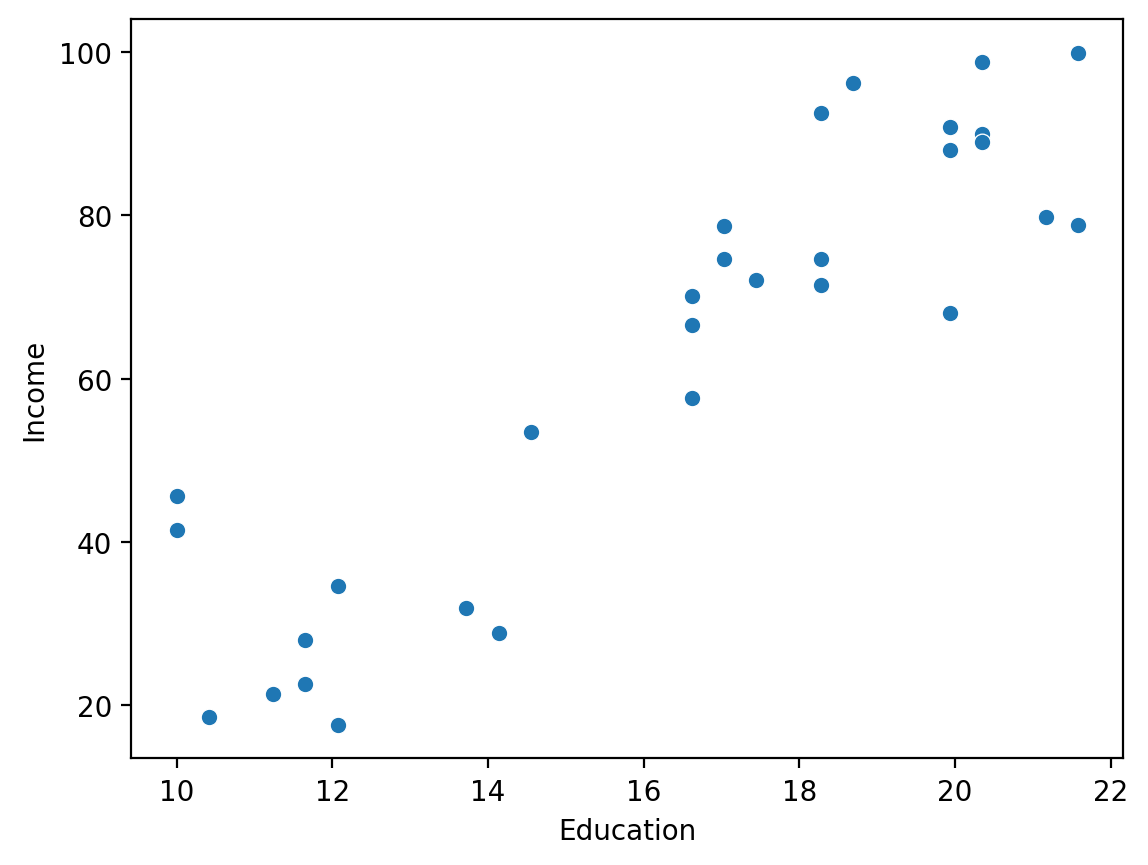
sns.scatterplot(data = df_income, x = "Education", y = "Income")
<Axes: xlabel='Education', ylabel='Income'>
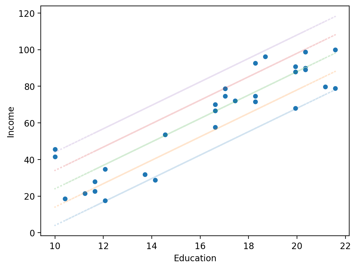
Same slope, different intercept#
sns.scatterplot(data = df_income, x = "Education", y = "Income")
for intercept in [-60, -50, -40, -30, -20]:
    y_pred = intercept + df_income['Education'] * 6.4
    plt.plot(df_income['Education'], y_pred, alpha = .2, linestyle = "dotted")
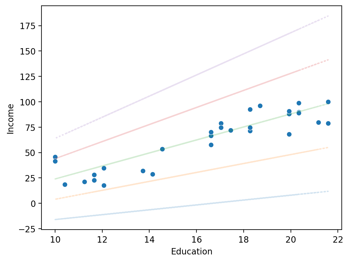
Same intercept, different slope#
sns.scatterplot(data = df_income, x = "Education", y = "Income")
for slope in [2.4, 4.4, 6.4, 8.4, 10.4]:
    y_pred = -40 + df_income['Education'] * slope
    plt.plot(df_income['Education'], y_pred, alpha = .2, linestyle = "dotted")
Some lines are better than others.#
We can quantify quality of fit by calculating prediction error in some way.
Simple approach: sum of squared deviations (residuals) between predictions \(\hat{Y}\) and actual values \(Y\).
\(\Large RSS = \sum_i^N (\hat{y}_i - y_i)^2\)
Check-in: Does this equation remind you of anything?
Analogy: \(SS_X\) vs. \(RSS\)#
The sum of squares of X is used in the standard deviation equation, and is defined as:
\(\Large SS_X = \sum_{i}^{N}(x_i - \mu)^2\)
Whereas RSS is defined as:
\(\Large RSS = \sum_i^N (\hat{y}_i - y_i)^2\)
MSE: the mean squared error#
We can also calculate the mean squared error (or MSE), i.e., the average squared deviation of each data-point \(Y_i\) from its predicted value \(\hat{Y}_i\).
\(\Large MSE = \frac{1}{N}*\sum_i^N (\hat{y}_i - y_i)^2\)
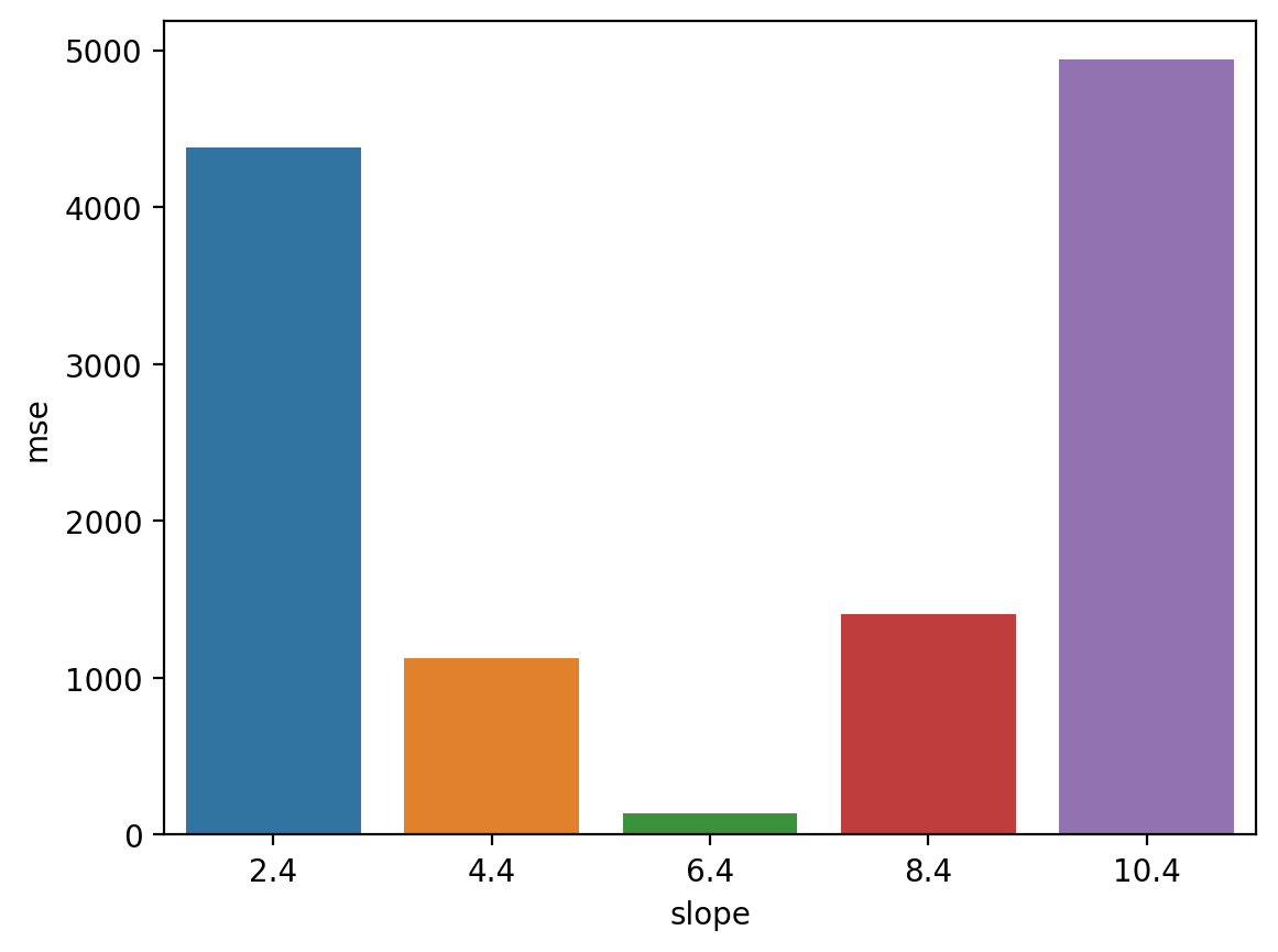
MSE in action (pt. 1)#
Steps:
For a range of possible slopes, calculate predicted values \(\hat{Y}\).
Then, calculate mean squared error bewteen predicted values and actual values \(Y\).
errors = []
SLOPES = [2.4, 4.4, 6.4, 8.4, 10.4]
for slope in SLOPES:
    y_pred = -40 + df_income['Education'] * slope
    mse = (1/len(df_income)) * sum((y_pred - df_income['Income'])**2) ## calculate mse
    errors.append({'slope': slope,
                  'mse': mse})
MSE in action (pt. 2)#
Now we can ask: which slope \(\beta\) had the lowest MSE?
df_errors = pd.DataFrame(errors)
sns.barplot(data = df_errors, x = "slope", y = "mse")
<Axes: xlabel='slope', ylabel='mse'>
Key assumptions#
All models have assumptions, linear regression included.
Some of these (e.g., homoscedasticity) will make more sense when we discuss measures of model fit in more depth.
For now, high-level summary.
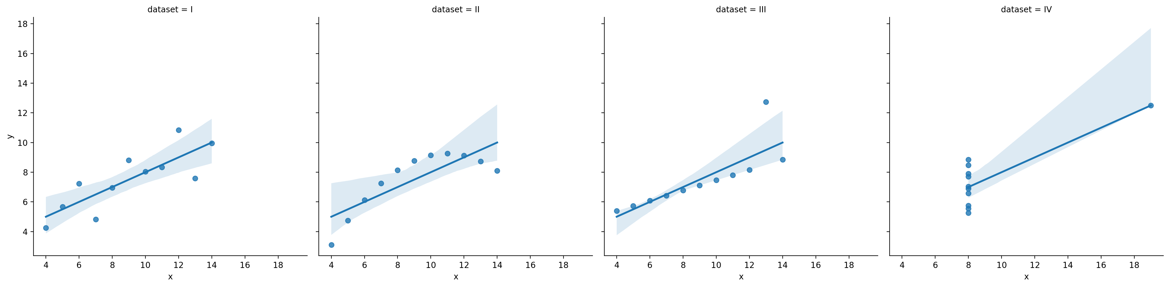
Assumption 1: Linearity#
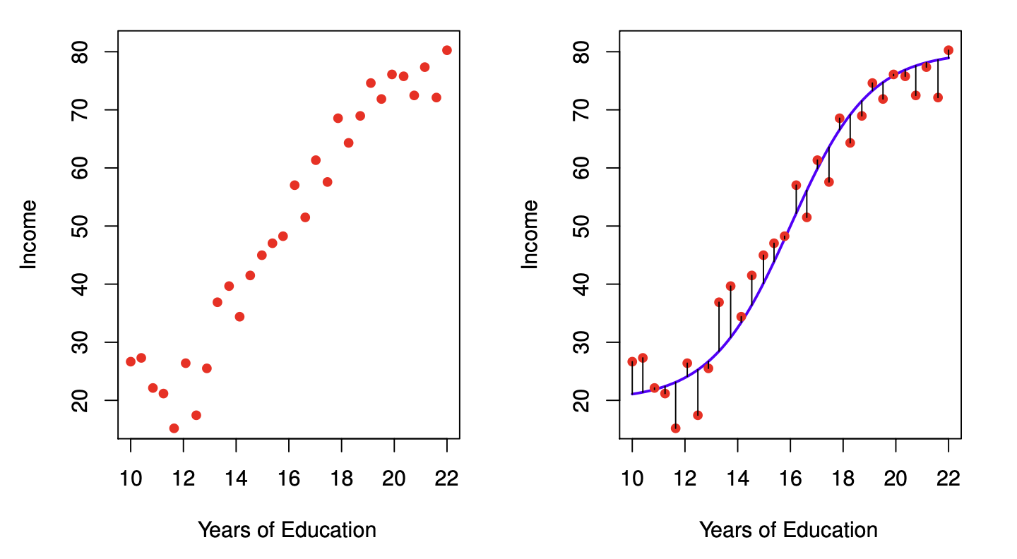
Linear regression assumes the function relating \(X\) and \(Y\) is linear––even if it’s not.
df_anscombe = sns.load_dataset("anscombe")
sns.lmplot(data = df_anscombe, x = "x", y = "y", col = "dataset")
/Users/seantrott/anaconda3/lib/python3.11/site-packages/seaborn/axisgrid.py:118: UserWarning: The figure layout has changed to tight
  self._figure.tight_layout(*args, **kwargs)
<seaborn.axisgrid.FacetGrid at 0x140b60290>
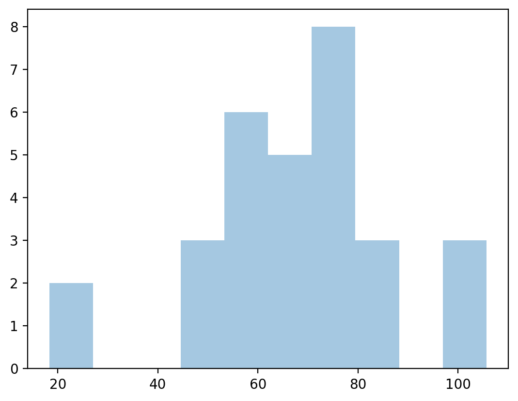
Assumption 2: Normally-distributed residuals#
Linear regression also assumes the residuals (i.e., the prediction errors) are normally-distributed.
Specifically, many estimates of prediction error depend on this assumption.
We’ll return to this in a later lecture!
resid = y_pred - df_income['Income'] ## calculate residuals
p = plt.hist(resid, alpha = .4)  ## plot them to see normality?
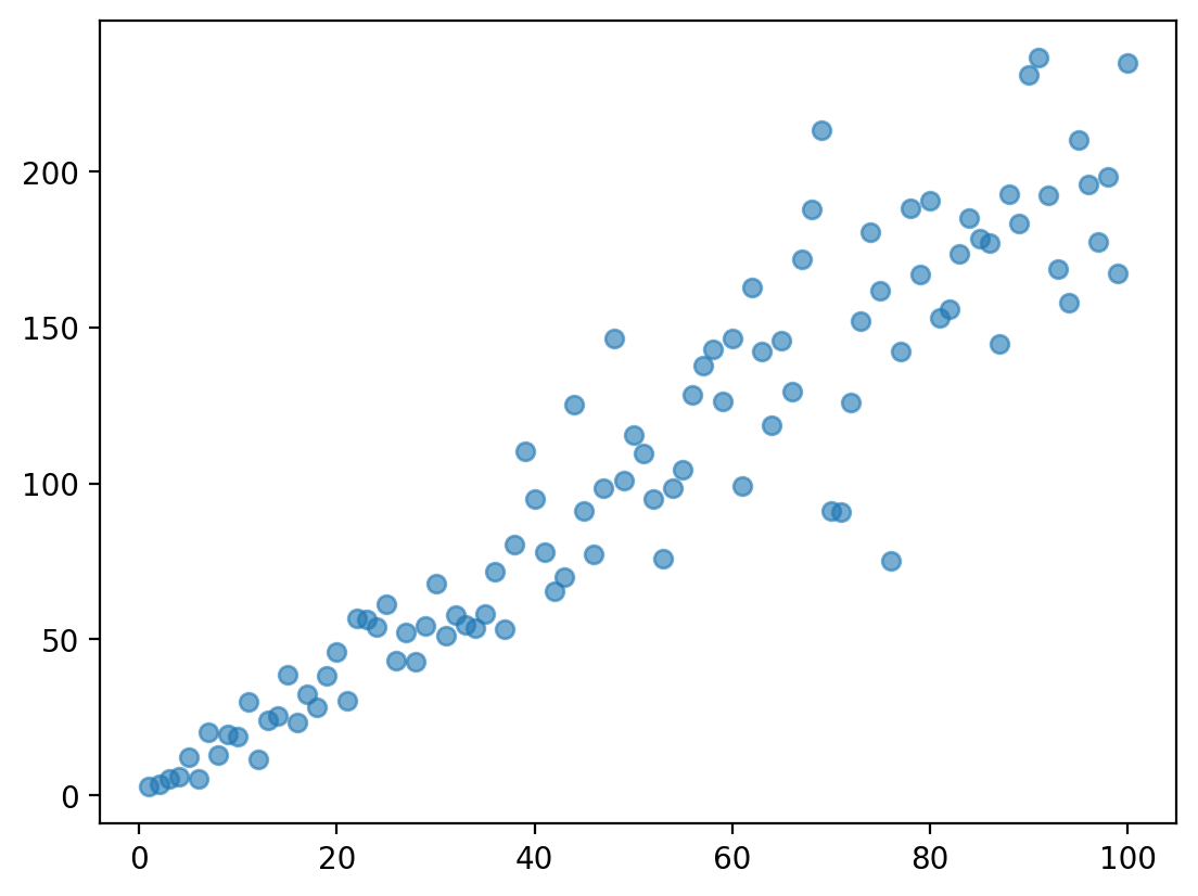
Assumption 3: Homoscedasticity#
Homoscedasticity means that the residuals are evenly distributed along the regression line.
The opposite of homoscedasticity is heteroscedasticity.
Again, this will become very important when we discuss measures of prediction error.
Heteroscedasticity in action#
Heteroscedasticity often (but not always) can be identified by a funnel-shape.
np.random.seed(1)
X = np.arange(1, 101)
y = X *2 + np.random.normal(loc = 0, scale = X/2, size = 100)
plt.scatter(X, y, alpha = .6)
<matplotlib.collections.PathCollection at 0x140a41290>
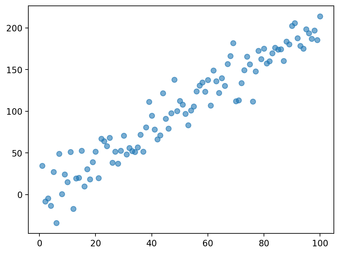
Check-in#
Does this data display heteroscedasticity? Why or why not?
np.random.seed(1)
X = np.arange(1, 101)
y = X *2 + np.random.normal(loc = 0, scale = 20, size = 100)
plt.scatter(X, y, alpha = .6)
<matplotlib.collections.PathCollection at 0x140952ad0>
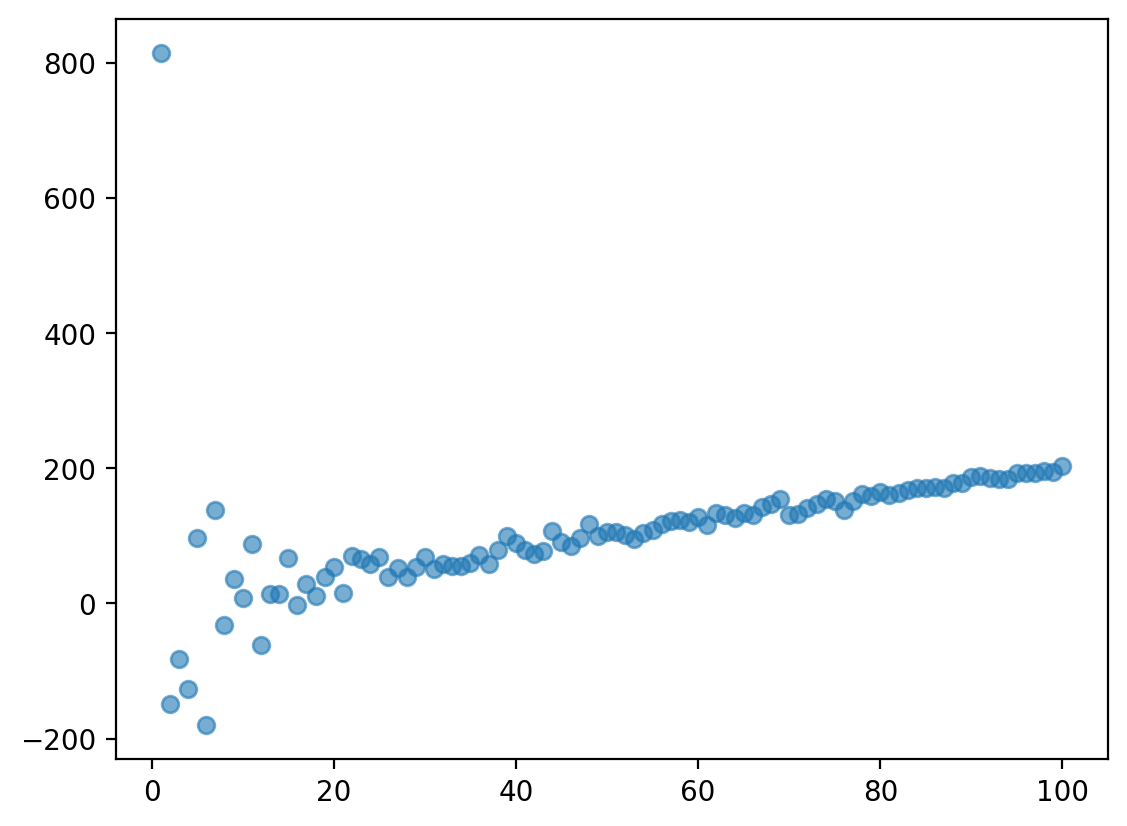
Check-in#
Does this data display heteroscedasticity? Why or why not?
np.random.seed(1)
X = np.arange(1, 101)
y = X *2 + np.random.normal(loc = 0, scale = 500/X, size = 100)
plt.scatter(X, y, alpha = .6)
<matplotlib.collections.PathCollection at 0x140e750d0>
Assumption 4: Independence#
Independence means that each event or observation in our dataset was generated by distinct processes.
An example of non-independence would be multiple observations from the same subject (or country, etc.).
Advanced statistical methods control for non-independence using mixed effects.
Conclusion#
This lecture marks a shift towards modeling our data.
Statistical models encode some functional relationship between our variables.
No model is perfect: all models have assumptions, and all models have prediction error.
Linear regression is a commonly used model for predicting continuous data.