Describing Data#
Looking back: Exploratory Data Analysis#
In Week 3, we dove deep into data visualization.
In Week 4, we’ve learned how to wrangle and clean our data.
Now we’ll turn to describing our data––as well as the foundations of statistics.
Goals of this lecture#
There are many ways to describe a distribution.
Here, we’ll cover:
Measures of central tendency: what’s the typical value in this distribution?
Measures of variability: how much do values differ from each other?
Detecting (potential) outliers with z-scores.
Measuring how distributions relate with linear correlations.
Importing relevant libraries#
import numpy as np
import matplotlib.pyplot as plt
import seaborn as sns ### importing seaborn
import pandas as pd
import scipy.stats as ss
%matplotlib inline
%config InlineBackend.figure_format = 'retina'
Central Tendency#
Central Tendency refers to the “typical value” in a distribution.
Many ways to measure what’s “typical”.
The
mean.The
median.The
mode.
Why is this useful?#
A dataset can contain lots of observations.
E.g., \(N = 5000\) survey responses about
height.
One way to “describe” this distribution is to visualize it.
But it’s also helpful to reduce that distribution to a single number.
This is necessarily a simplification of our dataset!
The mean#
The arithmetic mean is defined as the
sumof all values in a distribution, divided by the number of observations in that distribution.
numbers = [1, 2, 3, 4]
### Calculating the mean by hand
sum(numbers)/len(numbers)
2.5
numpy.mean#
The numpy package has a function to calculate the mean on a list or numpy.ndarray.
np.mean(numbers)
2.5
Calculating the mean of a pandas column#
If we’re working with a DataFrame, we can calculate the mean of specific columns.
df_gapminder = pd.read_csv("data/viz/gapminder_full.csv")
df_gapminder.head(2)
| country | year | population | continent | life_exp | gdp_cap | |
|---|---|---|---|---|---|---|
| 0 | Afghanistan | 1952 | 8425333 | Asia | 28.801 | 779.445314 |
| 1 | Afghanistan | 1957 | 9240934 | Asia | 30.332 | 820.853030 |
df_gapminder['life_exp'].mean()
59.474439366197174
Check-in#
How would you calculate the mean of the gdp_cap column?
### Your code here
Solution#
This tells us the average gdp_cap of countries in this dataset across all years measured.
df_gapminder['gdp_cap'].mean()
7215.327081212149
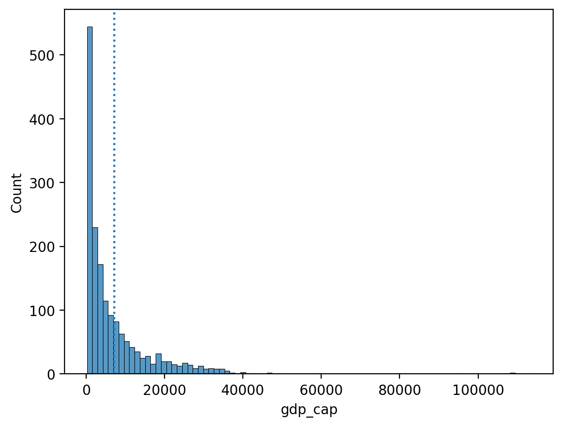
The mean and skew#
Skew means there are values elongating one of the “tails” of a distribution.
Of the measures of central tendency, the mean is most affected by the direction of skew.
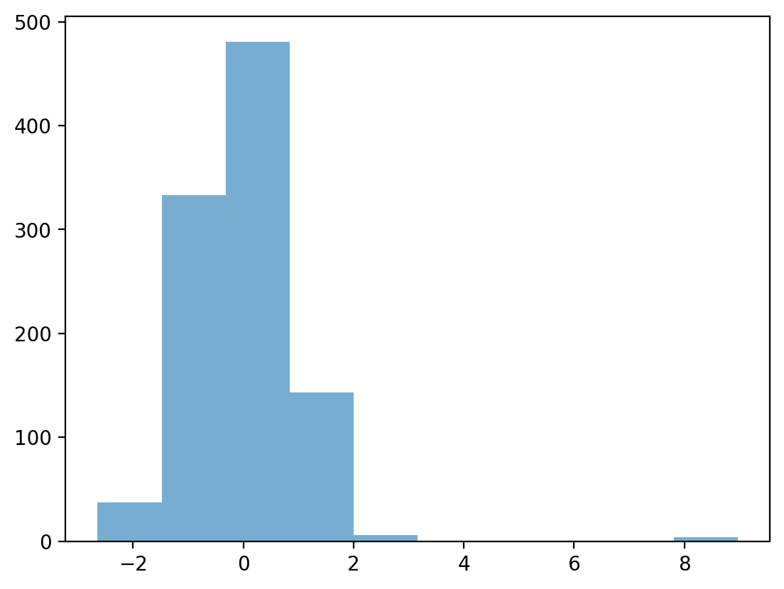
How would you describe the skew below?
Do you think the
meanwould be higher or lower than themedian?
sns.histplot(data = df_gapminder, x = "gdp_cap")
plt.axvline(df_gapminder['gdp_cap'].mean(), linestyle = "dotted")
<matplotlib.lines.Line2D at 0x13ea26d90>
Check-in#
Could you calculate the mean of the continent column? Why or why not?
### Your answer here
Solution#
You cannot calculate the mean of
continent, which is a categorical variable.The
meancan only be calculated for continuous variables.
Check-in#
Subtract each observation in
numbersfrom themeanof thislist.Then, calculate the sum of these deviations from the
mean.
What is their sum?
numbers = np.array([1, 2, 3, 4])
### Your code here
Solution#
The sum of deviations from the mean is equal to
0.This will be relevant when we discuss standard deviation.
deviations = numbers - numbers.mean()
sum(deviations)
0.0
Interim summary#
The
meanis one of the most common measures of central tendency.It can only be used for continuous interval/ratio data.
The sum of deviations from the mean is equal to
0.The
meanis most affected by skew and outliers.
The median#
The median is calculated by sorting all values from least to greatest, then finding the value in the middle.
If there is an even number of values, you take the mean of the middle two values.
df_gapminder['gdp_cap'].median()
3531.8469885
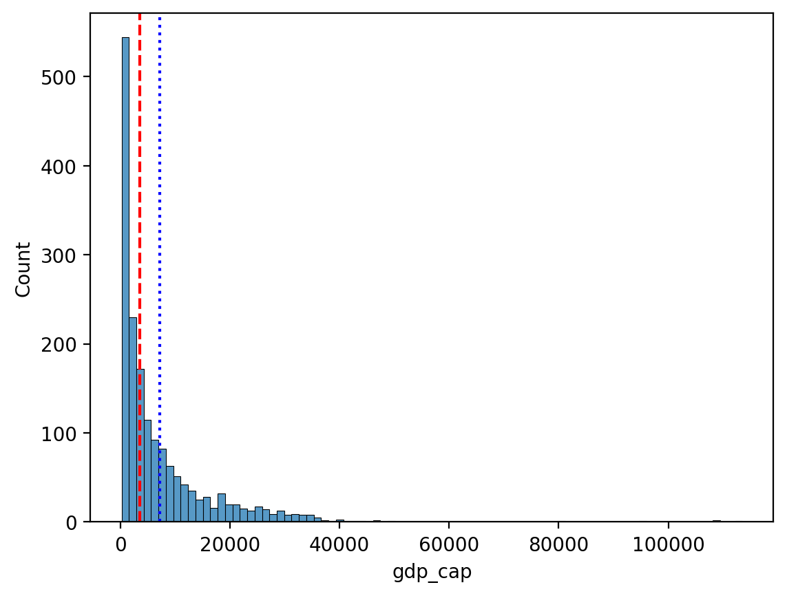
Comparing median and mean#
The median is less affected by the direction of skew.
sns.histplot(data = df_gapminder, x = "gdp_cap")
plt.axvline(df_gapminder['gdp_cap'].mean(), linestyle = "dotted", color = "blue")
plt.axvline(df_gapminder['gdp_cap'].median(), linestyle = "dashed", color = "red")
<matplotlib.lines.Line2D at 0x13ebaaa10>
Check-in#
Could you calculate the median of the continent column? Why or why not?
### Your answer here
Solution#
You cannot calculate the median of
continent, which is a categorical variable.The
mediancan only be calculated for ordinal (ranked) or interval/ratio variables.
The mode#
The mode is the most frequent value in a dataset.
Unlike the median or mean, the mode can be used with categorical data.
df_pokemon = pd.read_csv("data/pokemon.csv")
### Most common type = Water
df_pokemon['Type 1'].mode()
0    Water
Name: Type 1, dtype: object
mode() returns multiple values?#
If multiple values tie for the most frequent,
mode()will return all of them.This is because technically, a distribution can have multiple modes!
df_gapminder['gdp_cap'].mode()
0          241.165876
1          277.551859
2          298.846212
3          299.850319
4          312.188423
            ...
1699     80894.883260
1700     95458.111760
1701    108382.352900
1702    109347.867000
1703    113523.132900
Name: gdp_cap, Length: 1704, dtype: float64
Central tendency: a summary#
Measure |
Can be used for: |
Limitations |
|---|---|---|
Mean |
Continuous data |
Affected by skew and outliers |
Median |
Continuous data |
Doesn’t include values of all data points in calculation (only ranks) |
Mode |
Continuous and Categorical data |
Only considers the most frequent; ignores other values |
Variability#
Variability (or dispersion) refers to the degree to which values in a distribution are spread out, i.e., different from each other.
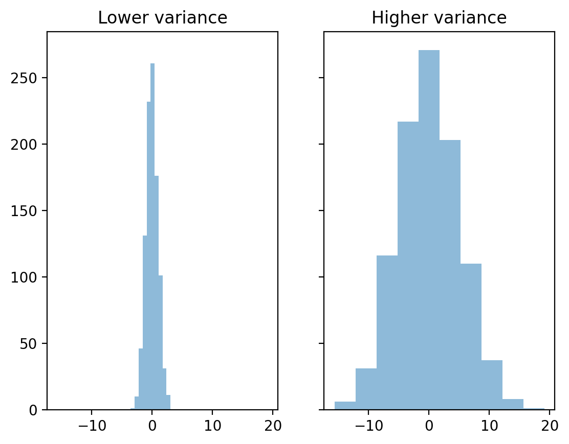
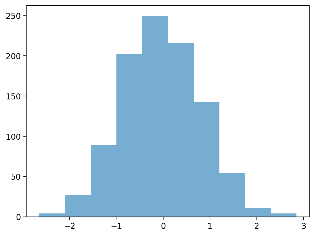
The mean hides variance#
Both distributions have the same mean, but different standard deviations.
### Create distributions
d1 = np.random.normal(loc = 0, scale = 1, size = 1000)
d2 = np.random.normal(loc = 0, scale = 5, size = 1000)
### Create subplots
fig, axes = plt.subplots(1, 2, sharex=True, sharey=True)
p1 = axes[0].hist(d1, alpha = .5)
p2 = axes[1].hist(d2, alpha = .5)
axes[0].set_title("Lower variance")
axes[1].set_title("Higher variance")
Text(0.5, 1.0, 'Higher variance')
Capturing variability#
There are at least three major approaches to quantifying variability:
Range: the difference between the
maximumandminimumvalue.Interquartile range (IQR): The range of the middle 50% of data.
Standard deviation: the typical amount that scores deviate from the mean.
Range#
Range is the difference between the
maximumandminimumvalue.
Intuitive, but only considers two values in the entire distribution.
d1.max() - d1.min()
6.594707869877328
d2.max() - d2.min()
34.720880205887084
IQR#
Interquartile range (IQR) is the difference between the value at the 75% percentile and the value at the 25% percentile.
Focuses on middle 50%, but still only considers two values.
## Get 75% and 25% values
q3, q1 = np.percentile(d1, [75 ,25])
q3 - q1
1.2975812653200791
## Get 75% and 25% values
q3, q1 = np.percentile(d2, [75 ,25])
q3 - q1
6.715031962827277
Standard deviation#
Standard deviation (SD) measures the typical amount that scores in a distribution deviate from the mean.
Things to keep in mind:
SD is the square root of the variance.
There are actually two measures of SD:
Population SD: when you’re measuring the entire population of interest (very rare).
Sample SD: when you’re measuring a sample (the typical case); we’ll focus on this one.
Sample SD#
The formula for sample standard deviation of \(X\) is as follows:
\(\Large s = \sqrt{\frac{\sum{(X_i - \bar{X})^2}}{n - 1}}\)
\(n\): number of observations.
\(\bar{X}\): mean of \(X\).
\(X_i - \bar{X}\): difference between a particular value of \(X\) and
mean.\(\sum\): sum of all these squared deviations.
Check-in#
The formula involves summing the squared deviations of each value in \(X\) with the mean of \(X\). Why do you think we square these deviations first?
\(\Large\sum{(X_i - \bar{X})^2}\)
### Your answer here
Solution#
If you simply summed the raw deviations from the mean, you’d get 0 (this is part of the definition of the mean).
SD, explained#
\(\Large s = \sqrt{\frac{\sum{(X_i - \bar{X})^2}}{n - 1}}\)
First, calculate sum of squared deviations.
What is total squared deviation from the
mean?
Then, divide by
n - 1: normalize to number of observations.What is average squared deviation from the
mean?
Finally, take the square root:
What is average deviation from the
mean?
Standard deviation represents the typical or “average” deviation from the mean.
Calculating SD in pandas#
df_pokemon['Attack'].std()
32.457365869498425
df_pokemon['HP'].std()
25.534669032332047
Watching out for np.std#
By default,
numpy.stdwill calculate the population standard deviation!Must modify the
ddofparameter to calculate sample standard deviation.
This is a very common mistake.
### Pop SD
d1.std()
0.9891122146847146
### Sample SD
d1.std(ddof = 1)
0.9896071420185057
Detecting (potential) outliers with z-scores#
Defining and detecting outliers is notoriously difficult.
Sometimes, an observation in a histogram clearly looks like an outlier.
But how do we quantify this?
What is a z-score?#
A z-score is a standardized measure of how many any given point deviates from the mean:
\(Z = \frac{X - \mu}{\sigma}\)
This is useful because it allows us to quantify the standardized distance between some observation and the mean.
Calculating z-scores#
## Original distribution
numbers
array([1, 2, 3, 4])
## z-scored distribution
numbers_z = (numbers - numbers.mean()) / numbers.std(ddof=1)
numbers_z
array([-1.161895 , -0.38729833, 0.38729833, 1.161895 ])
Check-in#
Can anyone deduce why a z-score would be useful for defining outliers?
Z-scores and outliers#
Outliers are data points that differ significantly from other points in a distribution.
A z-score gives us a standardized measure of how different a given value is from the rest of the distribution.
We can define thresholds, e.g.:
\(\Large z ≥ |3|\)
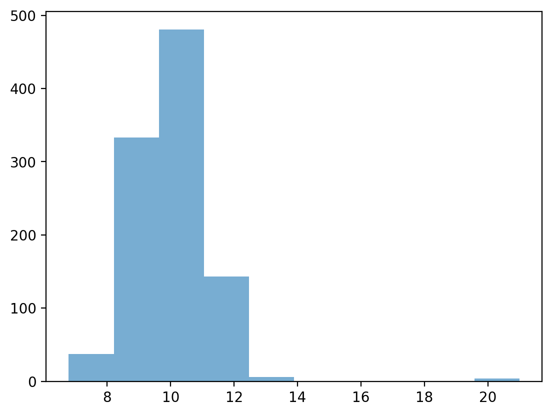
Testing our operationalization#
## First, let's define a distribution with some possible outliers
norm = np.random.normal(loc = 10, scale = 1, size = 1000)
upper_outliers = np.array([21, 21, 21, 21]) ## some random outliers
data = np.concatenate((norm, upper_outliers))
p = plt.hist(data, alpha = .6)
Z-scoring our distribution#
What is the z-score of the values way off to the right?
data_z = (data - data.mean()) / data.std(ddof=1)
p = plt.hist(data_z, alpha = .6)
Removing outliers#
data_z_filtered = data_z[abs(data_z)<=3]
p = plt.hist(data_z_filtered, alpha = .6)
Check-in#
Can anyone think of challenges or problems with this approach to detecting outliers?
Caveats, complexity, and context#
There is not a single unifying definition of what an outlier is.
Depending on the shape of the distribution, removing observations where \(z > |3|\) might be removing important data.
E.g., in a skewed distribution, we might just be “cutting off the tail”.
Even if the values do seem like outliers, there’s a philosophical question of why and what that means.
Are those values “random”? What’s the underlying *data-generating process?
This is why statistics is not a mere matter of applying formulas. Context always matters!
Describing bivariate data with correlations#
So far, we’ve been focusing on univariate data: a single distribution.
What if we want to describe how two distributions relate to each other?
For today, we’ll focus on continuous distributions.
Bivariate relationships: height#
A classic example of continuous bivariate data is the
heightof aparentandchild.
df_height = pd.read_csv("data/wrangling/height.csv")
df_height.head(2)
| Father | Son | |
|---|---|---|
| 0 | 65.0 | 59.8 |
| 1 | 63.3 | 63.2 |
Plotting Pearson’s height data#
sns.scatterplot(data = df_height, x = "Father", y = "Son", alpha = .5)
<Axes: xlabel='Father', ylabel='Son'>
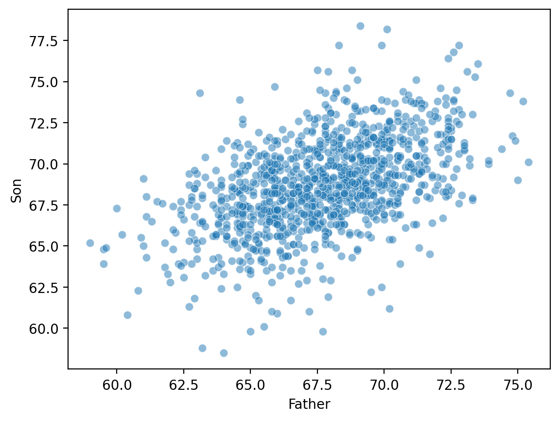
Introducing linear correlations#
A correlation coefficient is a number between \([–1, 1]\) that describes the relationship between a pair of variables.
Specifically, Pearson’s correlation coefficient (or Pearson’s \(r\)) describes a (presumed) linear relationship.
Two key properties:
Sign: whether a relationship is positive (+) or negative (–).
Magnitude: the strength of the linear relationship.
Calculating Pearson’s \(r\) with scipy#
scipy.stats has a function called pearsonr, which will calculate this relationship for you.
Returns two numbers:
\(r\): the correlation coefficent.
\(p\): the p-value of this correlation coefficient, i.e., whether it’s significantly different from
0.
ss.pearsonr(df_height['Father'], df_height['Son'])
PearsonRResult(statistic=0.5011626808075925, pvalue=1.2729275743650796e-69)
Check-in#
Using scipy.stats.pearsonr (here, ss.pearsonr), calculate Pearson’s \(r\) for the relationship between the Attack and Defense of Pokemon.
Is this relationship positive or negative?
How strong is this relationship?
### Your code here
Solution#
ss.pearsonr(df_pokemon['Attack'], df_pokemon['Defense'])
PearsonRResult(statistic=0.43868705511848904, pvalue=5.8584798642904e-39)
Check-in#
Pearson’r \(r\) measures the linear correlation between two variables. Can anyone think of potential limitations to this approach?
Limitations of Pearson’s \(r\)#
Pearson’s \(r\) presumes a linear relationship and tries to quantify its strength and direction.
But many relationships are non-linear!
Unless we visualize our data, relying only on Pearson’r \(r\) could mislead us.
Non-linear data where \(r = 0\)#
x = np.arange(1, 40)
y = np.sin(x)
p = sns.lineplot(x = x, y = y)
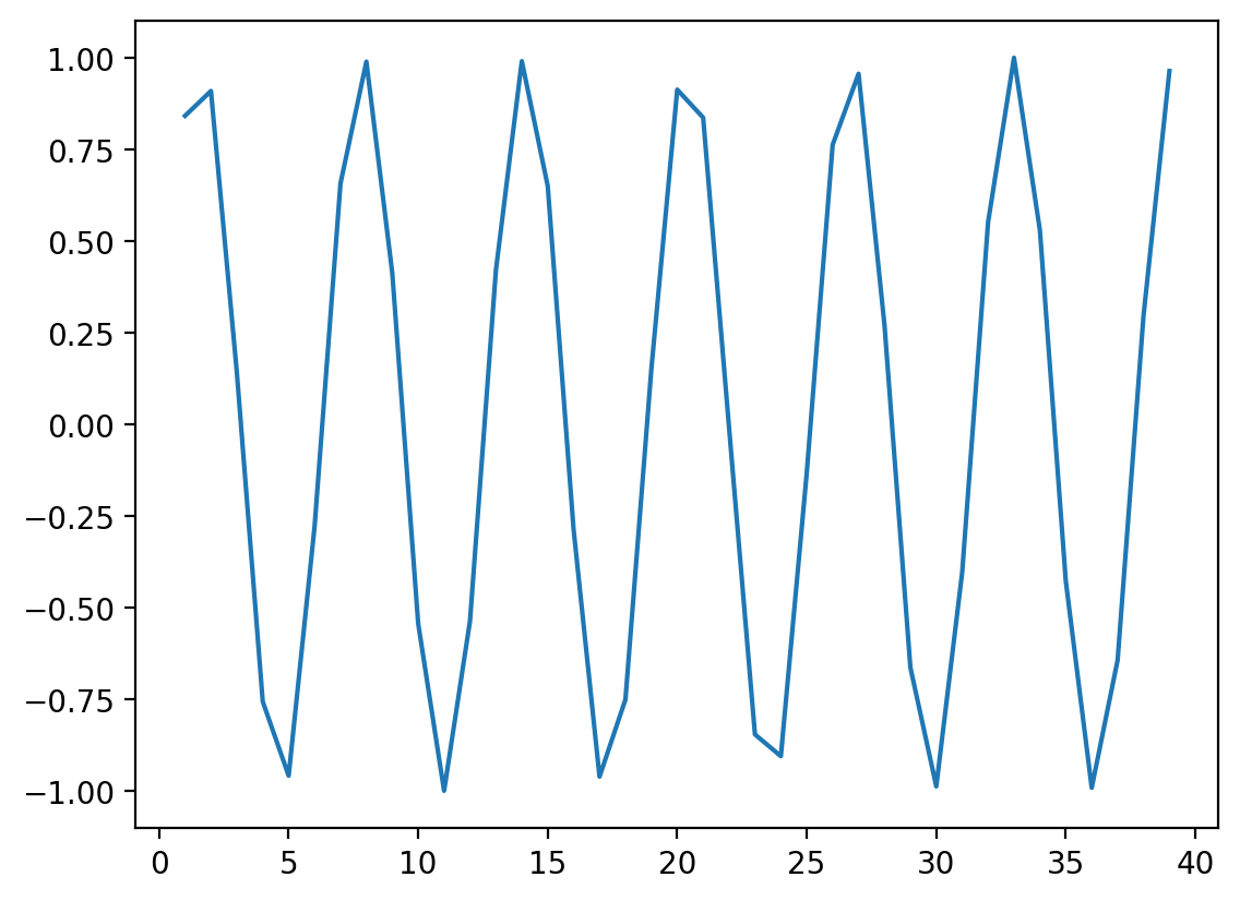
### r is close to 0, despite there being a clear relationship!
ss.pearsonr(x, y)
PearsonRResult(statistic=-0.04067793461845846, pvalue=0.8057827185936635)
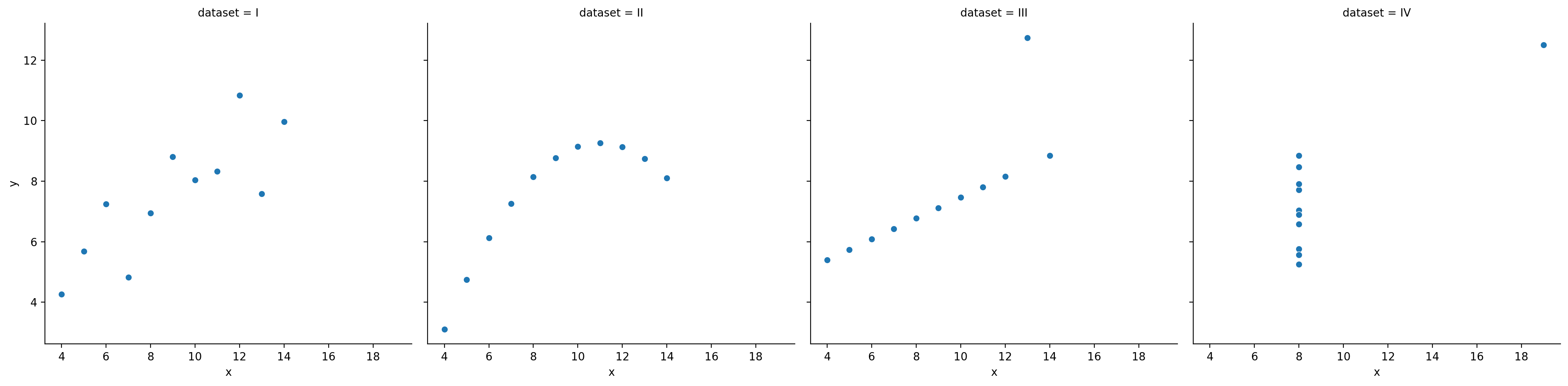
When \(r\) is invariant to the real relationship#
All these datasets have roughly the same correlation coefficient.
df_anscombe = sns.load_dataset("anscombe")
sns.relplot(data = df_anscombe, x = "x", y = "y", col = "dataset")
/Users/seantrott/anaconda3/lib/python3.11/site-packages/seaborn/axisgrid.py:118: UserWarning: The figure layout has changed to tight
  self._figure.tight_layout(*args, **kwargs)
<seaborn.axisgrid.FacetGrid at 0x13ee950d0>
Conclusion#
There are many ways to describe our data:
Measuring its central tendency.
Measuring its variability.
Measuring how it correlates with other data.
All of these are useful, and all are also simplifications.